Hot Off the Press
Scroll below for an assortment of articles featuring Joe McGuire Design.
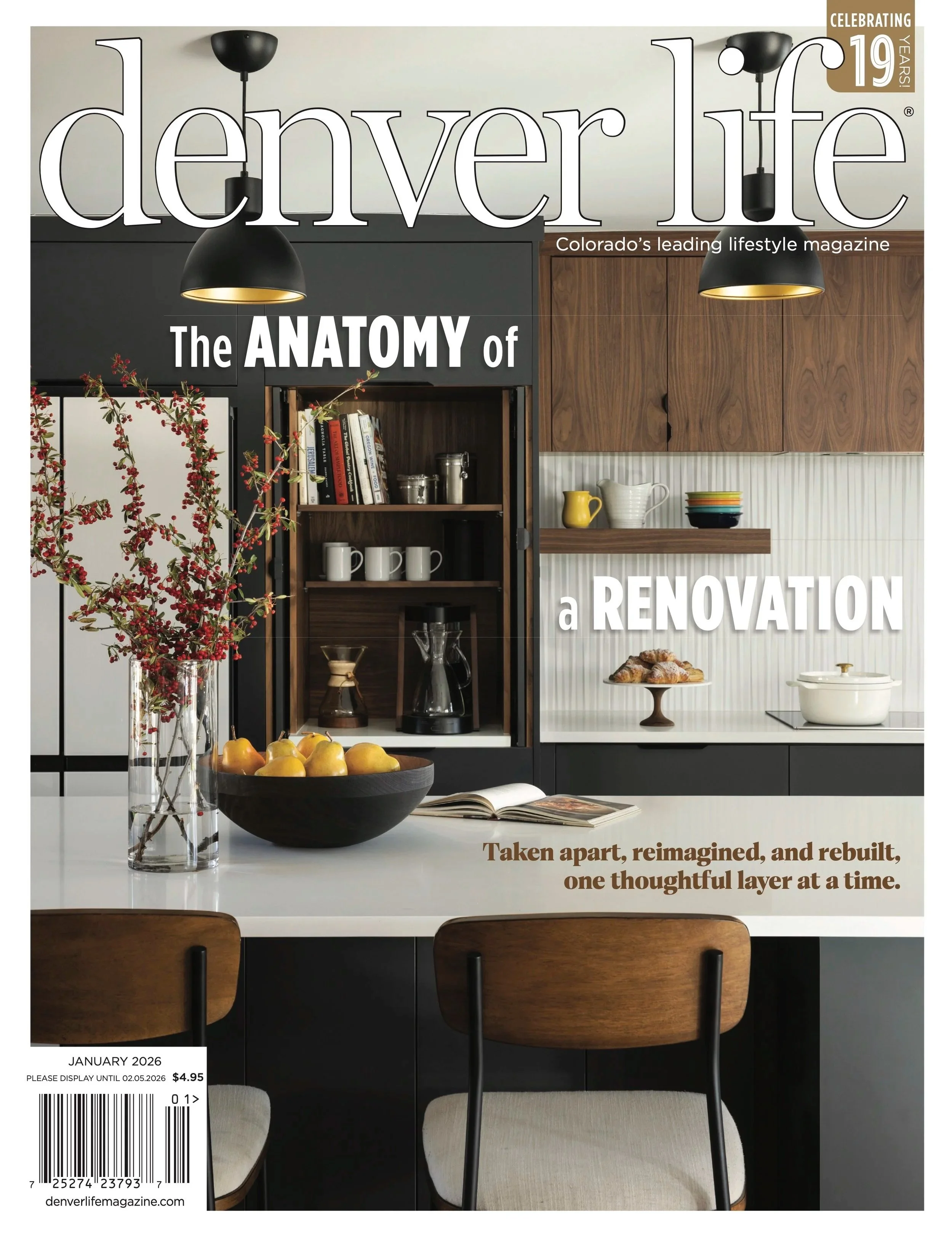
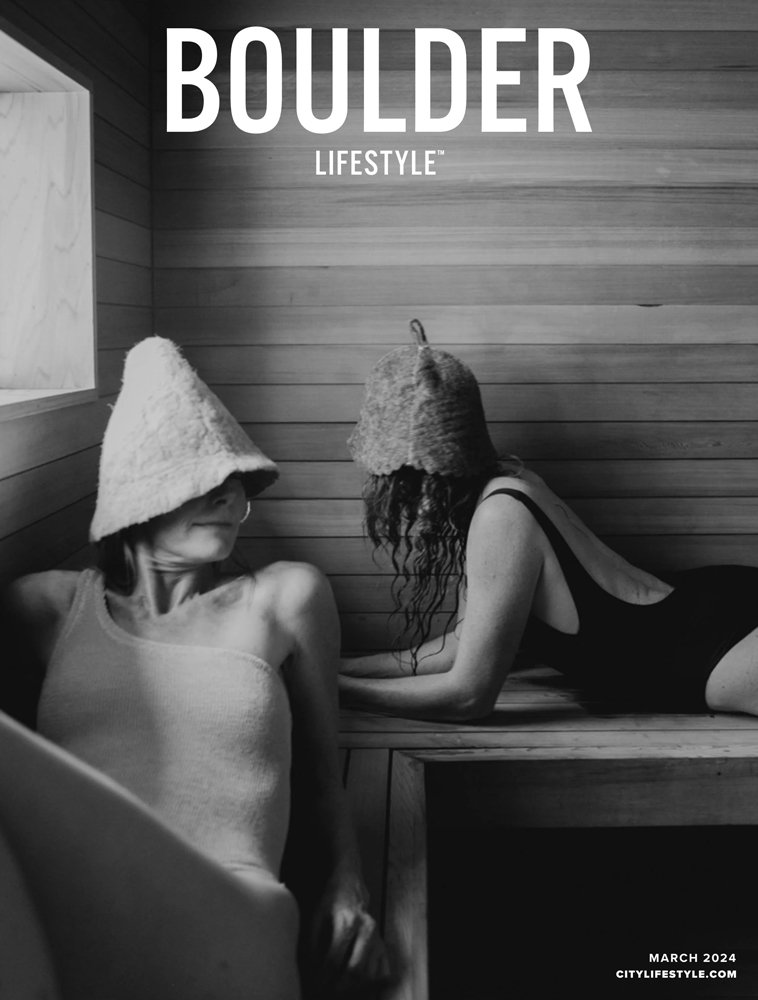
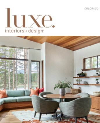
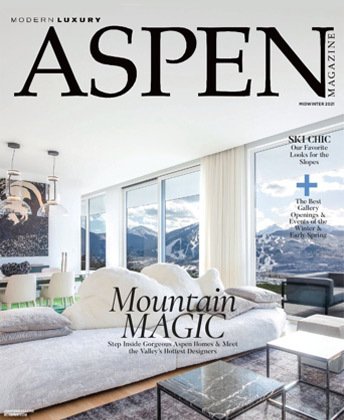
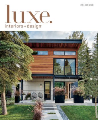
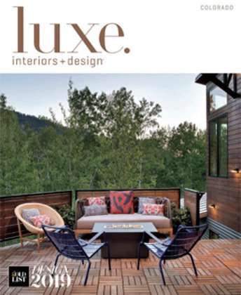
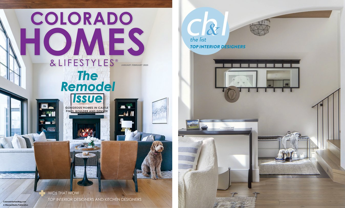
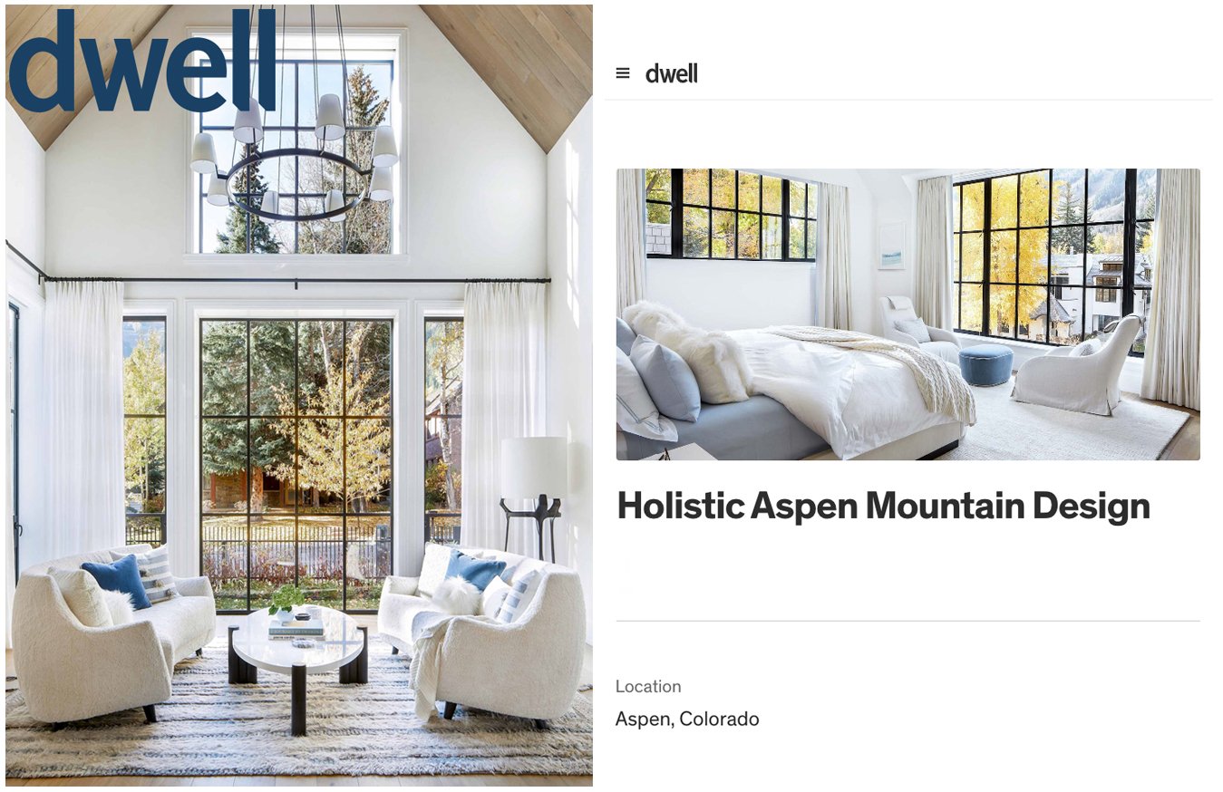
Joe McGuire Design has been featured in some of Colorado’s top publications, such as Luxe, Colorado Homes & Lifestyles, and Aspen Sojourner for our Aspen, Boulder and Denver interior design projects. Scroll down to read the articles in more depth!


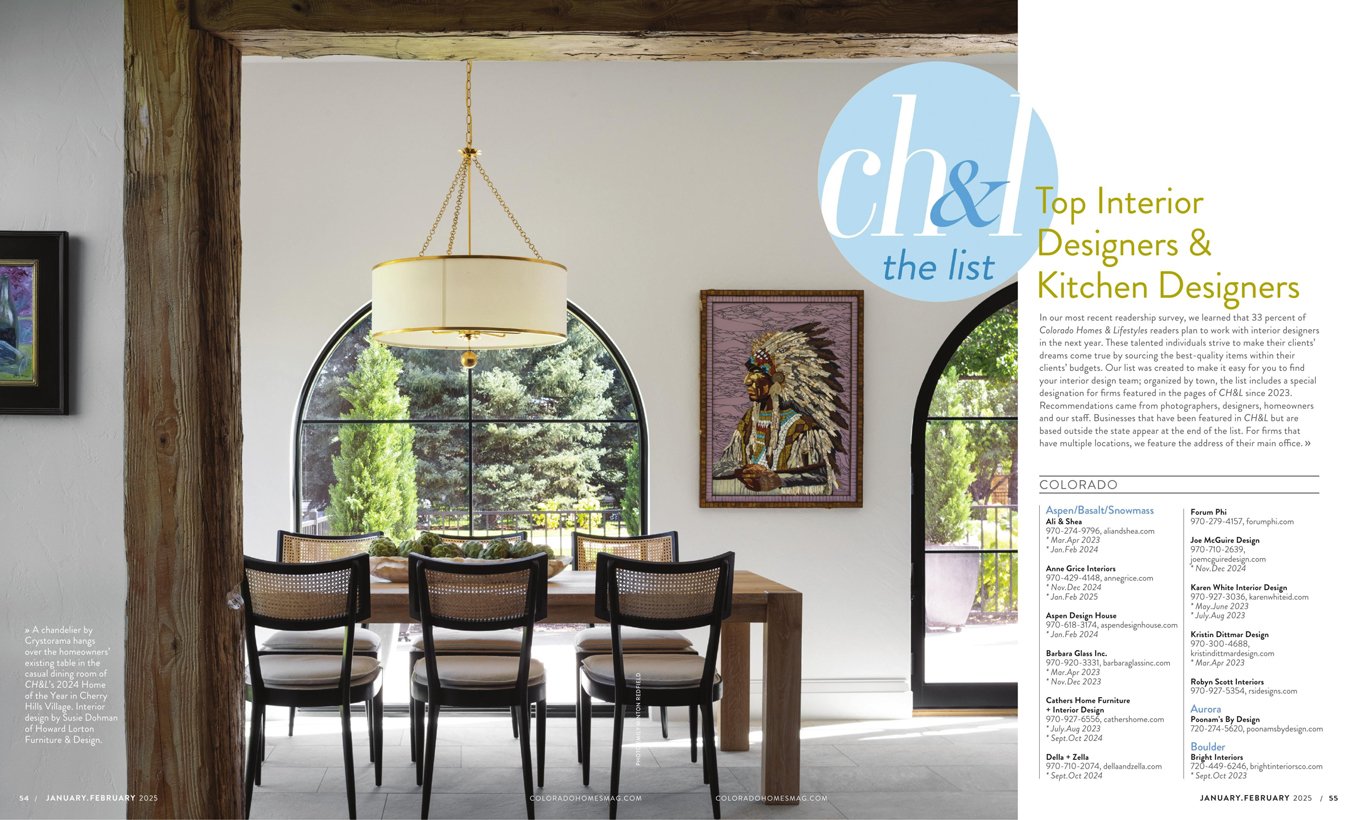
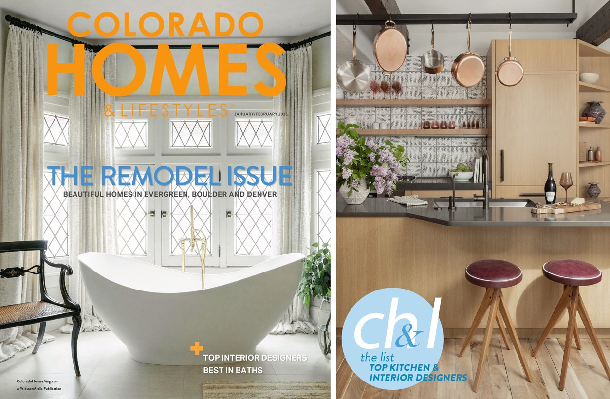
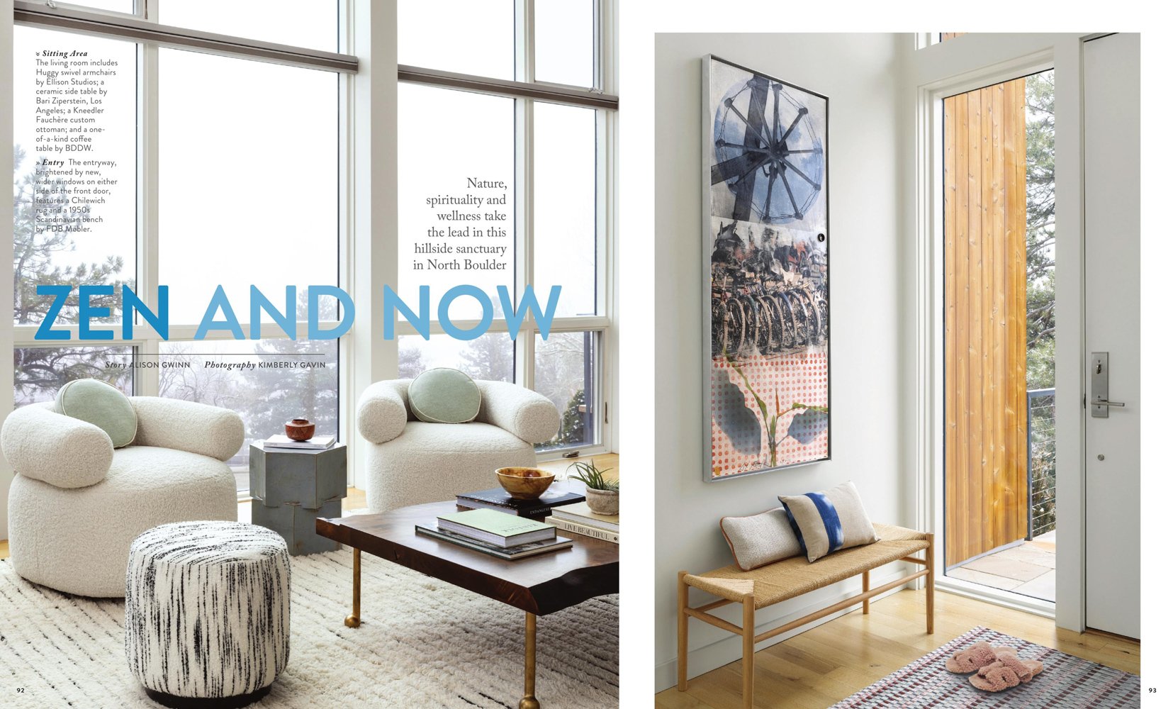
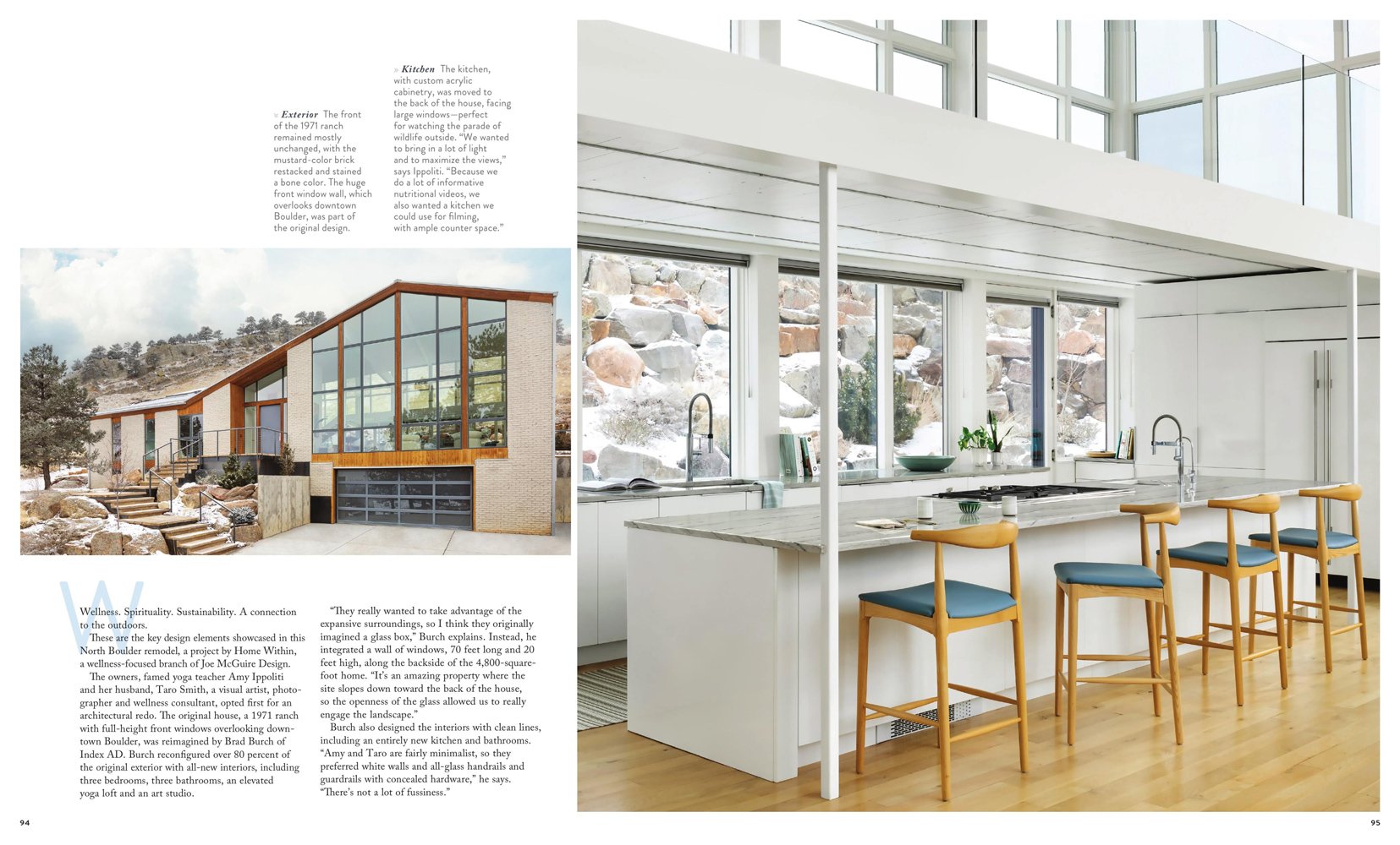

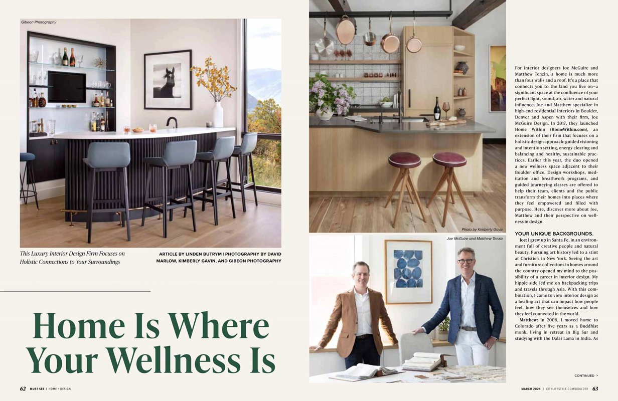
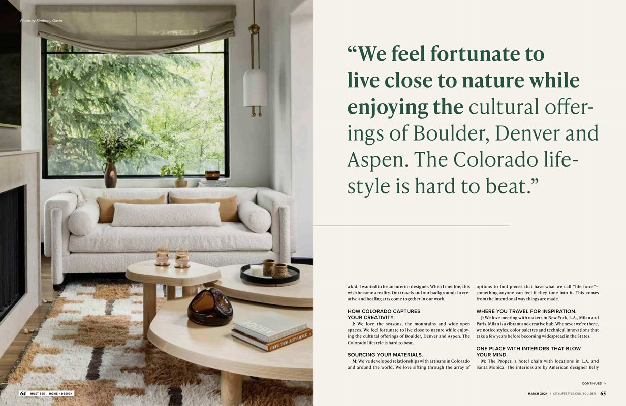
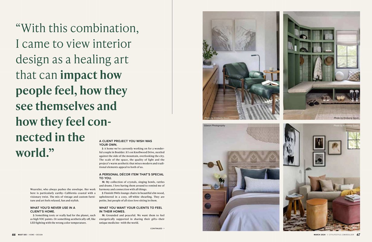
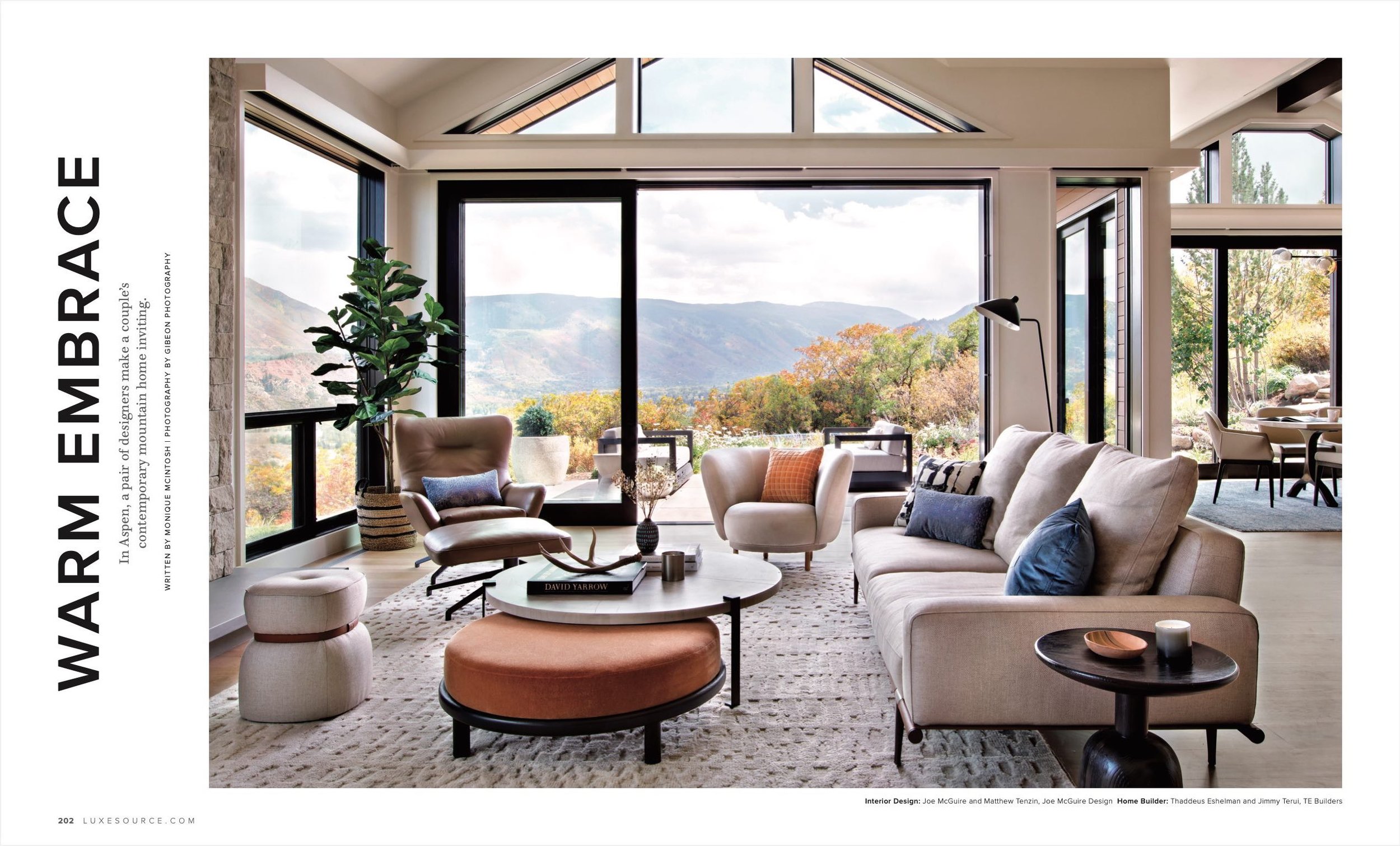
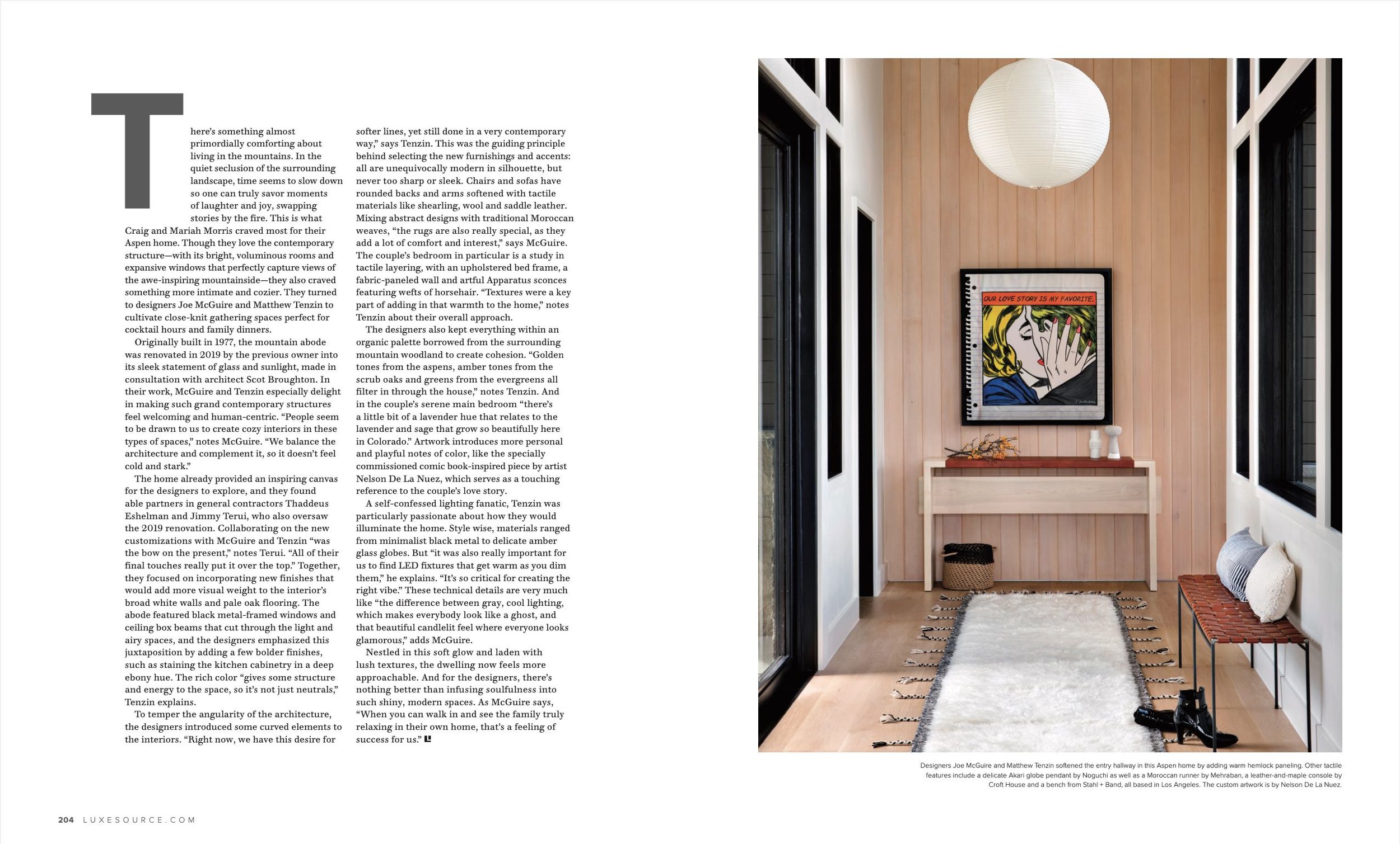
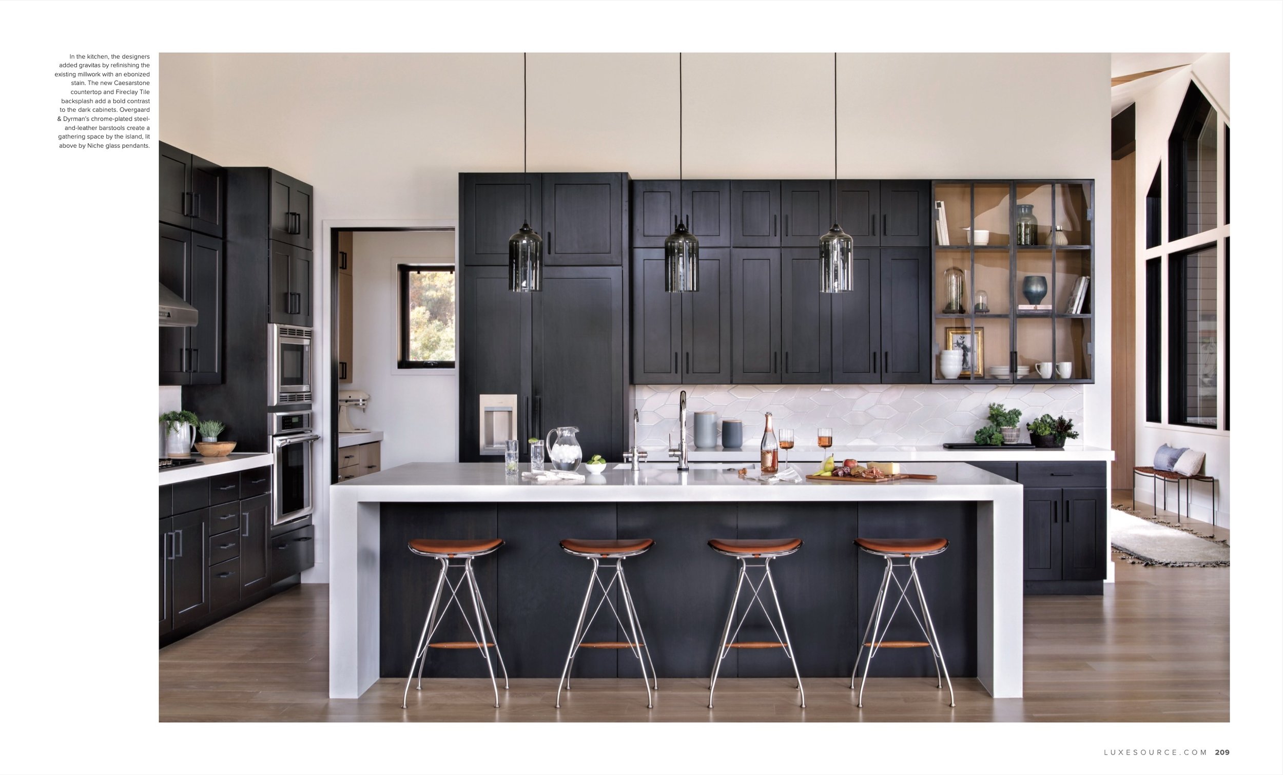
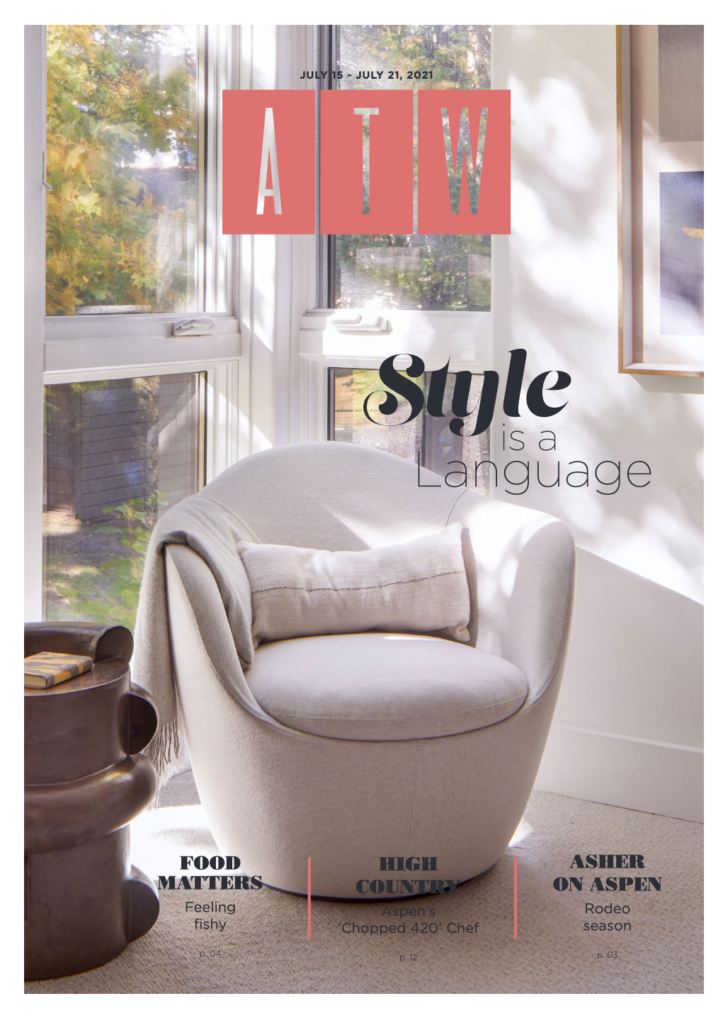
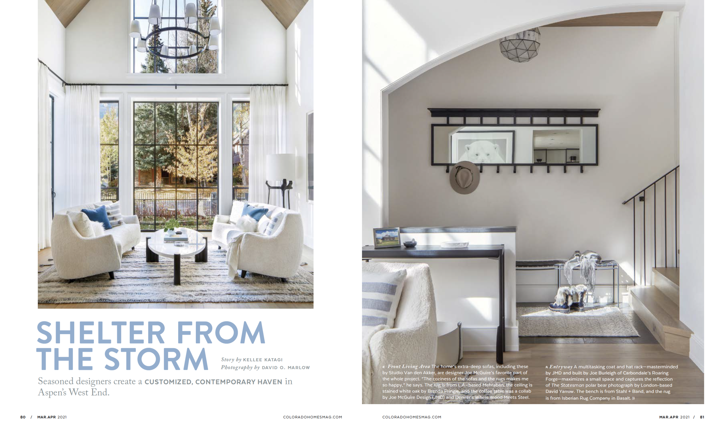
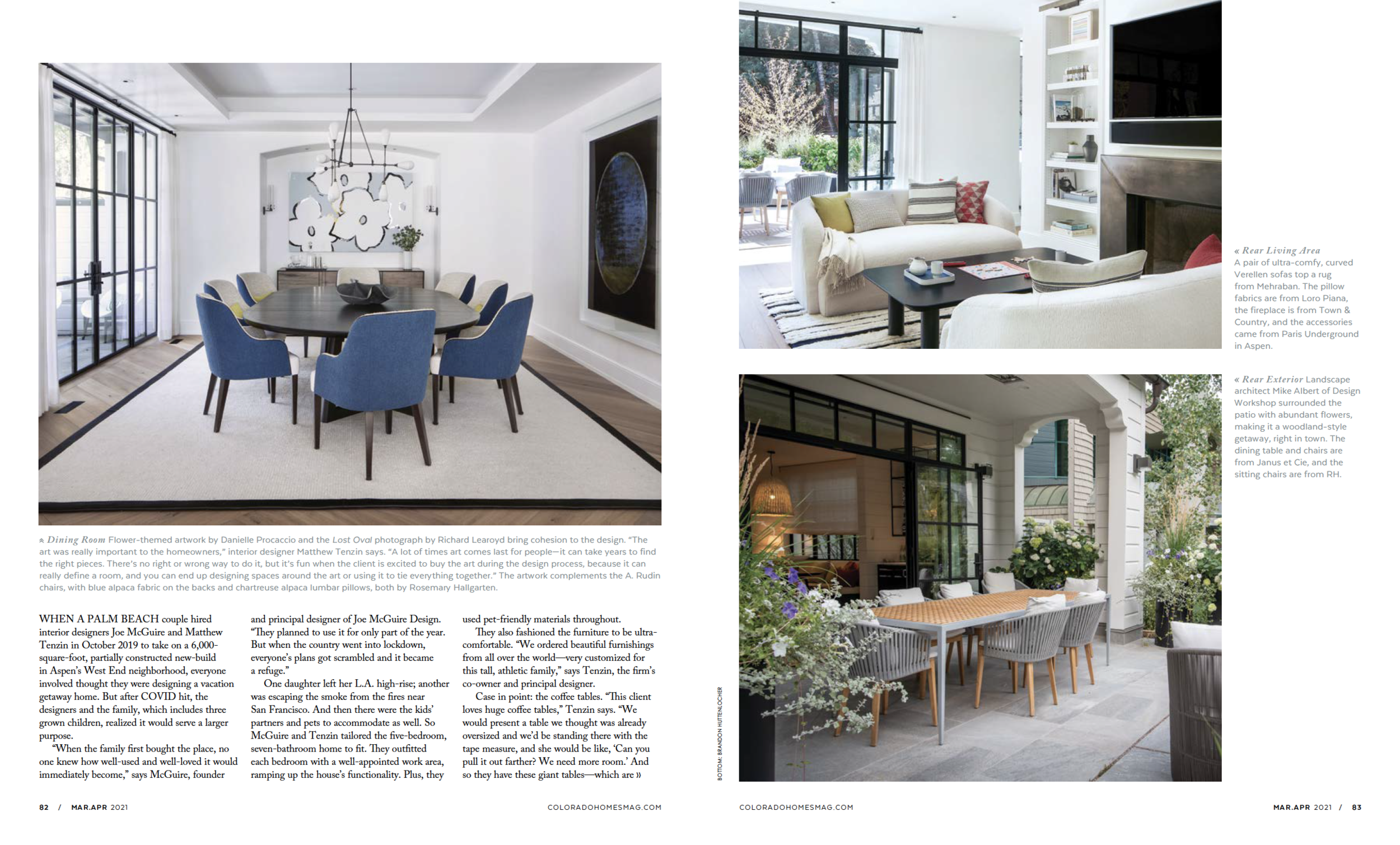
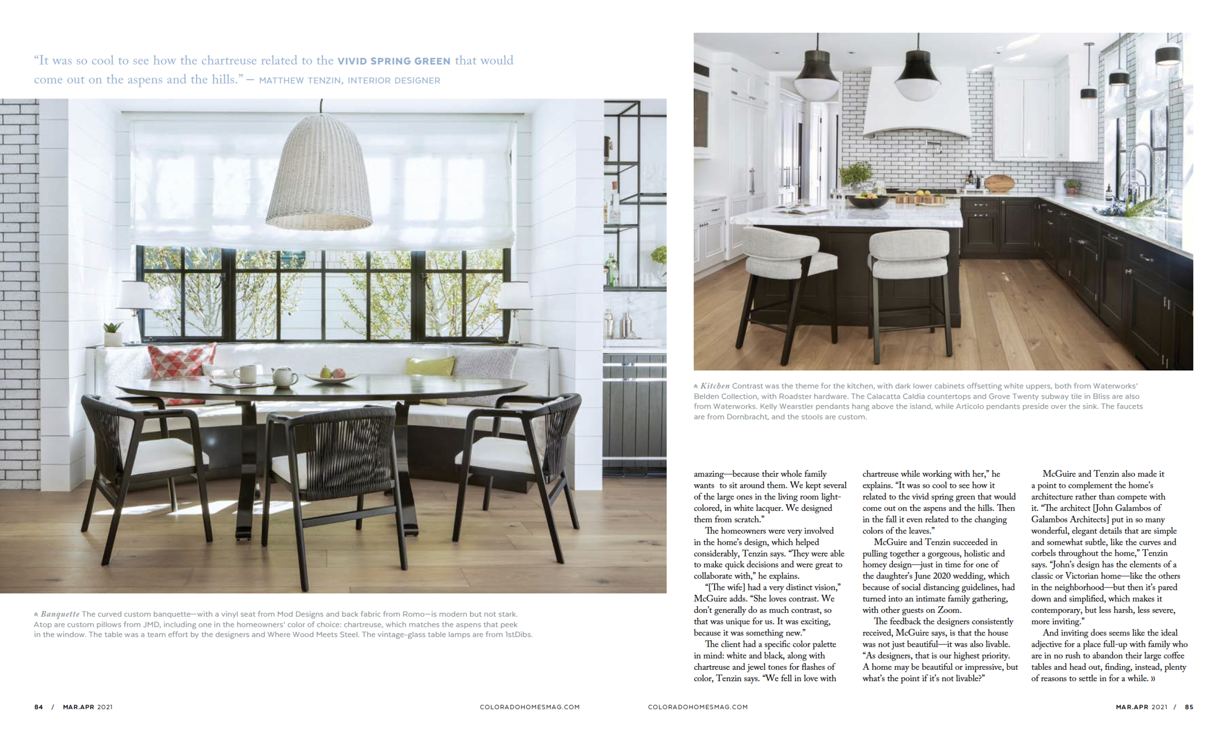
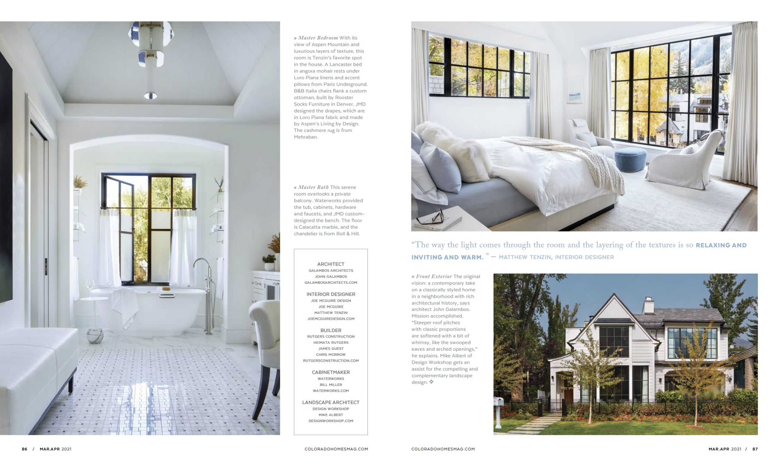

“Shelter from the Storm” Featured in Colorado Homes Magazine
Written by Kellee Katagi, Photography by David O. Marlow
When a Palm Beach couple hired interior designers Joe McGuire and Matthew Tenzin in October 2019 to take on a 6,000- square-foot, partially constructed new-build in Aspen’s West End neighborhood, everyone involved thought they were designing a vacation getaway home. But after COVID hit, the designers and the family, which includes three grown children, realized it would serve a larger purpose.
+ Click here to read the full article!
When a Palm Beach couple hired interior designers Joe McGuire and Matthew Tenzin in October 2019 to take on a 6,000- square-foot, partially constructed new-build in Aspen’s West End neighborhood, everyone involved thought they were designing a vacation getaway home. But after COVID hit, the designers and the family, which includes three grown children, realized it would serve a larger purpose.
“When the family first bought the place, no one knew how well-used and well-loved it would immediately become,” says McGuire, founder and principal designer of Joe McGuire Design. “They planned to use it for only part of the year. But when the country went into lockdown, everyone’s plans got scrambled and it became a refuge.”
One daughter left her L.A. high-rise; another was escaping the smoke from the fires near San Francisco. And then there were the kids’ partners and pets to accommodate as well. So McGuire and Tenzin tailored the five-bedroom, seven-bathroom home to fit. They outfitted each bedroom with a well-appointed work area, ramping up the house’s functionality. Plus, they used pet-friendly materials throughout.
They also fashioned the furniture to be ultra-comfortable. “We ordered beautiful furnishings from all over the world—very customized for this tall, athletic family,” says Tenzin, the firm’s co-owner and principal designer.
Case in point: the coffee tables. “This client loves huge coffee tables,” Tenzin says. “We would present a table we thought was already oversized and we’d be standing there with the tape measure, and she would be like, ‘Can you pull it out farther? We need more room.’ And so they have these giant tables—which are amazing—because their whole family wants to sit around them. We kept several of the large ones in the living room light-colored, in white lacquer. We designed them from scratch.”
The homeowners were very involved in the home’s design, which helped considerably, Tenzin says. “They were able to make quick decisions and were great to collaborate with,” he explains.
“[The wife] had a very distinct vision,” McGuire adds. “She loves contrast. We don’t generally do as much contrast, so that was unique for us. It was exciting, because it was something new.”
The client had a specific color palette in mind: white and black, along with chartreuse and jewel tones for flashes of color, Tenzin says. “We fell in love with chartreuse while working with her,” he explains. “It was so cool to see how it related to the vivid spring green that would come out on the aspens and the hills. Then in the fall it even related to the changing colors of the leaves.”
McGuire and Tenzin succeeded in pulling together a gorgeous, holistic and homey design—just in time for one of the daughter’s June 2020 wedding, which because of social distancing guidelines, had turned into an intimate family gathering, with other guests on Zoom.
The feedback the designers consistently received, McGuire says, is that the house was not just beautiful—it was also livable. “As designers, that is our highest priority. A home may be beautiful or impressive, but what’s the point if it’s not livable?”
McGuire and Tenzin also made it a point to complement the home’s architecture rather than compete with it. “The architect [John Galambos of Galambos Architects] put in so many wonderful, elegant details that are simple and somewhat subtle, like the curves and corbels throughout the home,” Tenzin says. “John’s design has the elements of a classic or Victorian home—like the others in the neighborhood—but then it’s pared down and simplified, which makes it contemporary, but less harsh, less severe, more inviting.”
And inviting does seems like the ideal adjective for a place full-up with family who are in no rush to abandon their large coffee tables and head out, finding, instead, plenty of reasons to settle in for a while.
“Enlightened Design” Featured in the Aspen Sojourner
Written by Sarah Chase Shaw, Photography by David O. Marlow
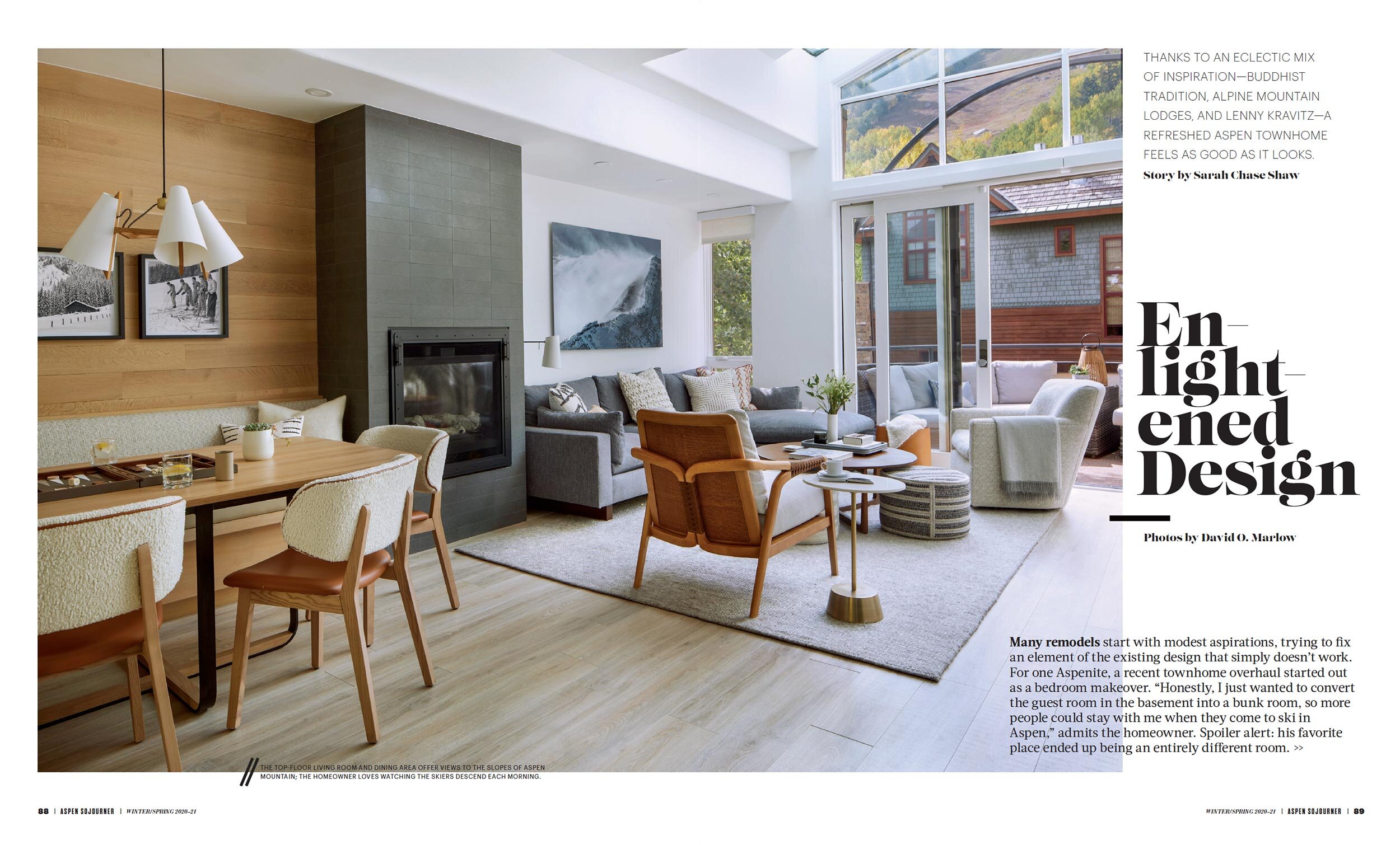
Many remodels start with modest aspirations, trying to fix an element of the existing design that simply doesn’t work. For one Aspenite, a recent townhome overhaul started out as a bedroom makeover. “Honestly, I just wanted to convert the guest room in the basement into a bunk room, so more people could stay with me when they come to ski in Aspen,” admits the homeowner. Spoiler alert: his favorite place ended up being an entirely different room.
+ Click here to read the full article!
Many remodels start with modest aspirations, trying to fix an element of the existing design that simply doesn’t work. For one Aspenite, a recent townhome overhaul started out as a bedroom makeover. “Honestly, I just wanted to convert the guest room in the basement into a bunk room, so more people could stay with me when they come to ski in Aspen,” admits the homeowner. Spoiler alert: his favorite place ended up being an entirely different room.
In design lingo, that bunk room was a “gotta-have.” The additional “nice-to-have” elements evolved organically as the owner and his family became more invested in their home, say Joe McGuire and Matthew Tenzin of Aspen- and Boulder-based Joe McGuire Design.
The room in question sits on the bottom floor of a four-story townhome tucked into a neighborhood of old and new condos, townhomes, and single-family homes at the base of Aspen Mountain. Originally designed by Charles Cunniffe in the late 1980s, the red sandstone–clad rowhouses are tall and narrow, with highly sought-after, south-facing living room views of the ski area, from Kleenex Corner and the Little Nell run to more technical sections of the World Cup downhill course like Aztec, Spring Pitch, and Strawpile. A large window over the kitchen sink offers the opposite vista: a bird’s-eye view of downtown Aspen filtered through the leaves of adjacent trees, which yields a panorama of light and color, day or night and season after season.
The owner, an East Coast transplant who loves adventure and world travel, purchased the unit with the intent to create an alpine lodge where family and friends could freely come and go, and always have a place to gather at the end of the day. While the townhome’s location near Aspen Mountain was a major selling point, its floor plan and ability to accommodate numerous guests were what won him over. Vertical living doesn’t appeal to everyone, but for him, the privacy between floors is key to enjoying a house full of visitors. “Each floor is almost like its own apartment,” he explains. “One family can stay in the bunk room, while another couple occupies the guest suite one floor above. We can be in the master suite and not hear anyone else in the house.”
Now living in Boulder, McGuire used to be a familiar face at Montecito Home Furnishings—a staple of Aspen’s interior design scene from the mid-1990s through the early 2000s—and a fixture at the town’s major social events, once even gracing the cover of a local magazine as Aspen’s go-to designer. Honing his skills during that period, McGuire learned how to balance luxury with comfort. Almost more importantly, he says, working at Montecito taught him empathy, a quality that “is truly the foundation of a service business.”
While most designers and architects emphasize livability, what sets Tenzin and McGuire apart is their collective background in meditation and healing arts; Tenzin was a Buddhist monk, and McGuire taught English and studied meditation at the Dalai Lama’s monastery in Dharamsala, India. “It’s really important to us that spaces feel as good as they look”, says McGuire. “Our training in Buddhist and Shamanic approaches for rebalancing and clearing spaces informs the way we balance comfort and function with aesthetics.” For both men, the mood and energy of a space is just as important as the objects within it. “If a beautiful room doesn’t feel good, there’s a pretty good chance no one will want to use it,” says McGuire.
At the time he was purchasing the Aspen townhome, the owner was also looking at spaces in a New York building that had been designed by singer-songwriter Lenny Kravitz. “He gave us this quote from Lenny,” recalls McGuire, “that really summed up his feelings: ‘Home should be a place where you feel like yourself and where your spirit is comfortable.’”
Occasionally, creating that type of comfort benefits from some extra steps. That’s where Tenzin’s separate company, True Home Design, comes in. The emotional imprint of a home’s former occupants can greatly impact the way a space feels, he says. Through a process of meditation and inner visioning, combined with space clearing and blessing, Tenzin offers clients the opportunity to clarify their aesthetic style, ultimately arriving at a practical design plan.
As it turns out, this townhome, which had already been lightly remodeled, simply needed a refresh to update a slightly outdated Western theme—including plenty of antlers—and make it feel like the home the owner described. Adds Tenzin, “Even though he admitted he had no idea what we were talking about, our client was very open to our desire to clear the space of any leftover energy.”
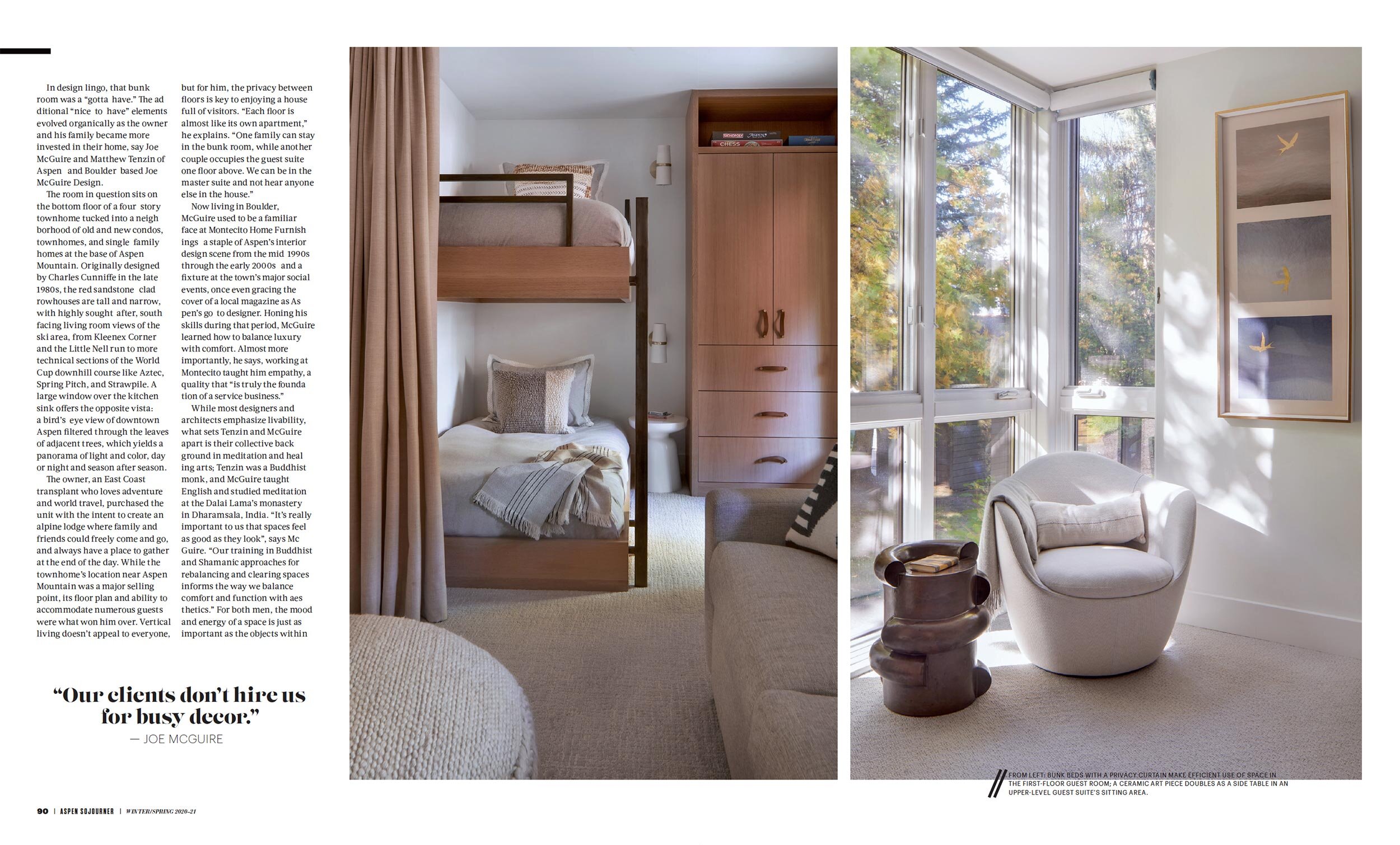
Together with contractor Ben Allen of Basalt-based I.A. Sedgwick, McGuire and Tenzin first tackled the guest room overhaul, installing two sets of floating bunks, with one set separated by privacy curtains hung on hidden ceiling tracks. From there, the team worked its way upward through the other floors, infusing the 2,600-square-foot townhome with all the trappings of a contemporary alpine adventure lodge. These include a collection of fine art images by local photographers that feature ethereal winter scenes of Aspen’s high country, as well as other unique pieces sourced from craftspeople and galleries locally and abroad.
Two bedroom suites—a guest and a master—also include the kind of artistic yet functional furnishings that the design team loves to source, like a glazed ceramic sculptural piece from Pitkin Projects in Aspen that doubles as a side table. In both rooms, windows join together in a corner to create a treehouse-like quality that emphasizes the signature spare, neutral palette that the designers use. “Our clients don’t hire us for busy decor,” notes McGuire.
On the top floor, high ceilings coupled with an array of south-facing windows provide a transparent curtain between indoors and out. Mountain light—crisp, clear, and bright in all seasons—floods the living room, highlighting the muted, earthy tones of the furnishings and creating ever-changing patterns of shade and shadow on the clean white walls.
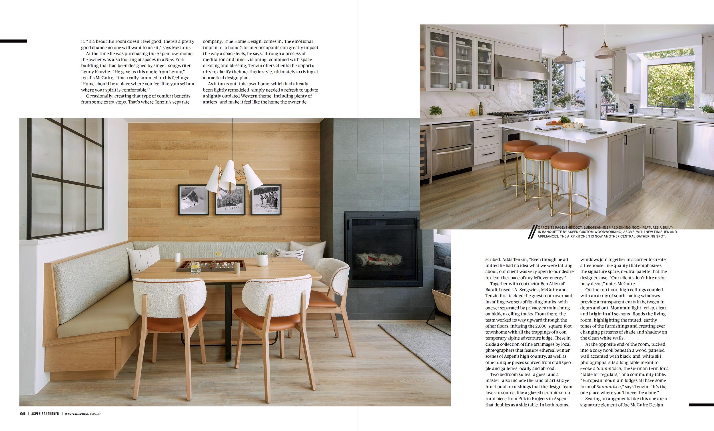
At the opposite end of the room, tucked into a cozy nook beneath a wood-paneled wall accented with black-and-white ski photographs, sits a long table meant to evoke a Stammtisch, the German term for a “table for regulars,” or a community table. “European mountain lodges all have some form of Stammtisch,” says Tenzin. “It’s the one place where you’ll never be alone.”
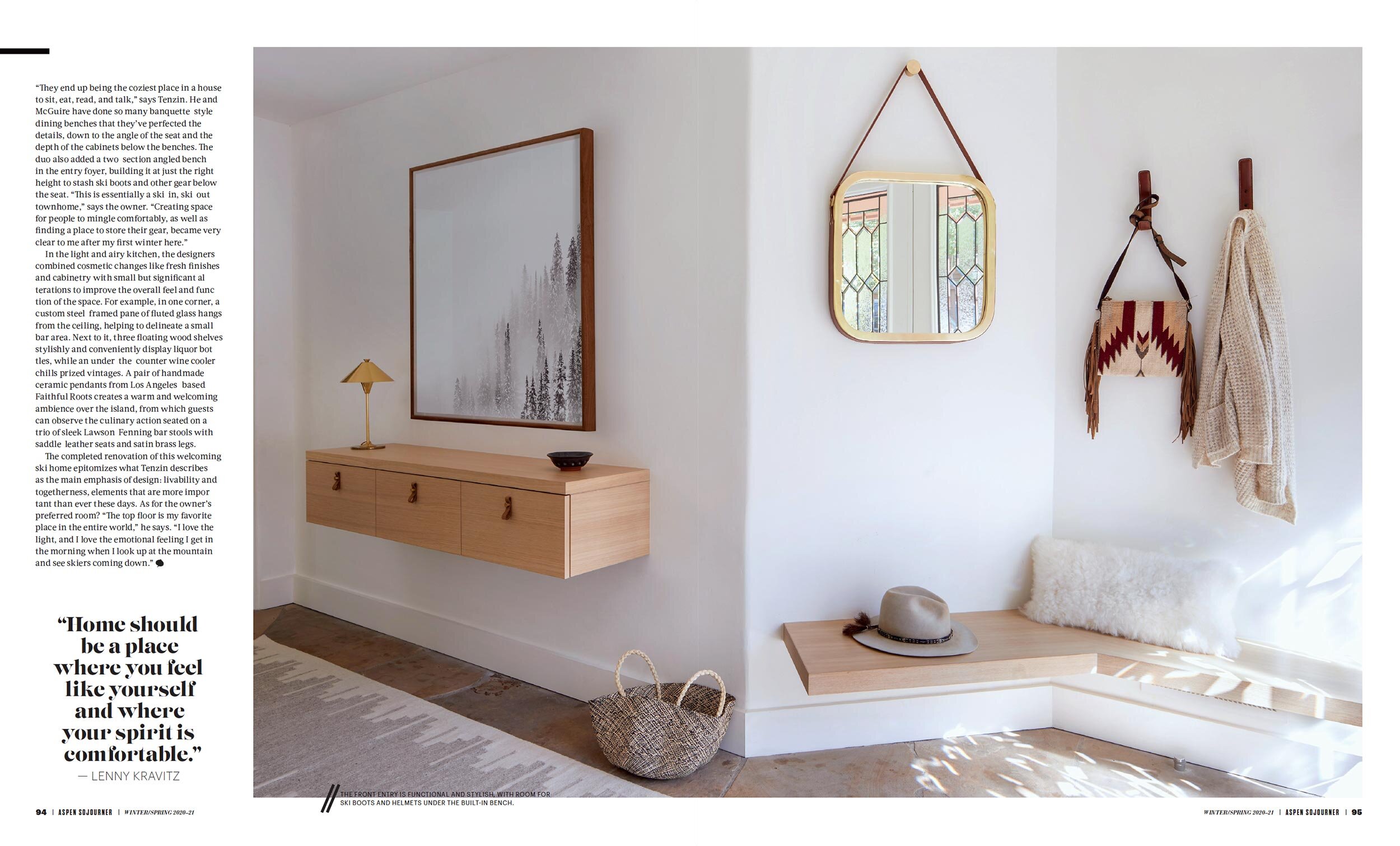
Seating arrangements like this one are a signature element of Joe McGuire Design. “They end up being the coziest place in a house to sit, eat, read, and talk,” says Tenzin. He and McGuire have done so many banquette-style dining benches that they’ve perfected the details, down to the angle of the seat and the depth of the cabinets below the benches. The duo also added a two-section angled bench in the entry foyer, building it at just the right height to stash ski boots and other gear below the seat. “This is essentially a ski-in, ski-out townhome,” says the owner. “Creating space for people to mingle comfortably, as well as finding a place to store their gear, became very clear to me after my first winter here.”
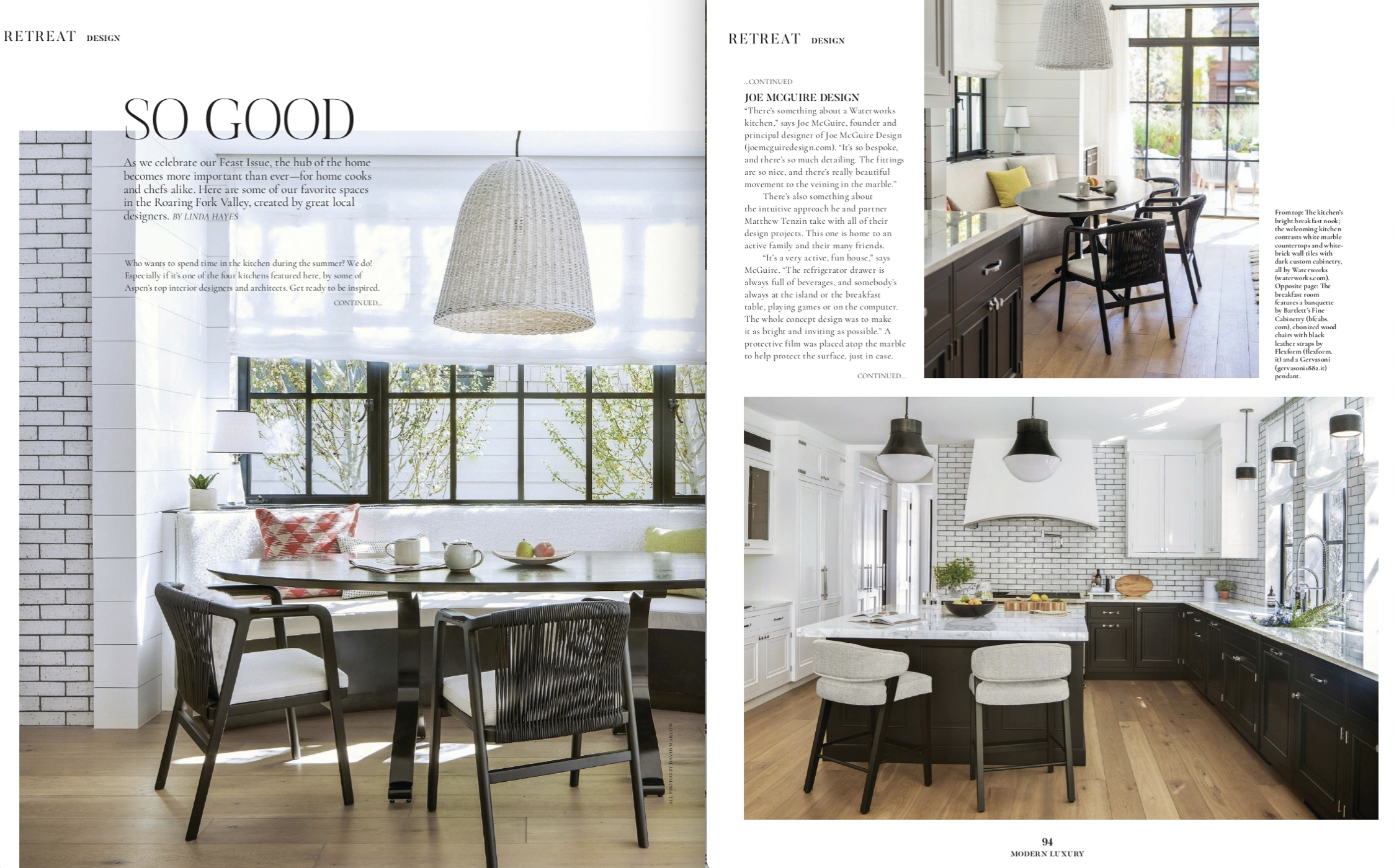
In the light and airy kitchen, the designers combined cosmetic changes like fresh finishes and cabinetry with small but significant alterations to improve the overall feel and function of the space. For example, in one corner, a custom steel-framed pane of fluted glass hangs from the ceiling, helping to delineate a small bar area. Next to it, three floating wood shelves stylishly and conveniently display liquor bottles, while an under-the-counter wine cooler chills prized vintages. A pair of handmade ceramic pendants from Los Angeles–based Faithful Roots creates a warm and welcoming ambience over the island, from which guests can observe the culinary action seated on a trio of sleek Lawson-Fenning bar stools with saddle-leather seats and satin brass legs.
The completed renovation of this welcoming ski home epitomizes what Tenzin describes as the main emphasis of design: livability and togetherness, elements that are more important than ever these days. As for the owner’s preferred room? “The top floor is my favorite place in the entire world,” he says. “I love the light, and I love the emotional feeling I get in the morning when I look up at the mountain and see skiers coming down.”
“Mountain Muse” Featured in Luxe
Written by Laura Mauk, Photography by Peter and Kelley Gibeon
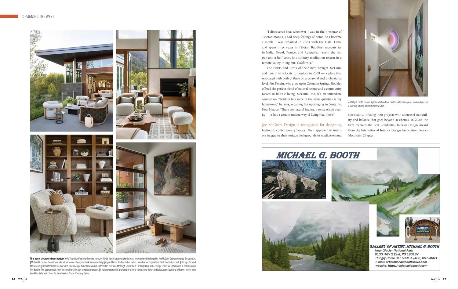
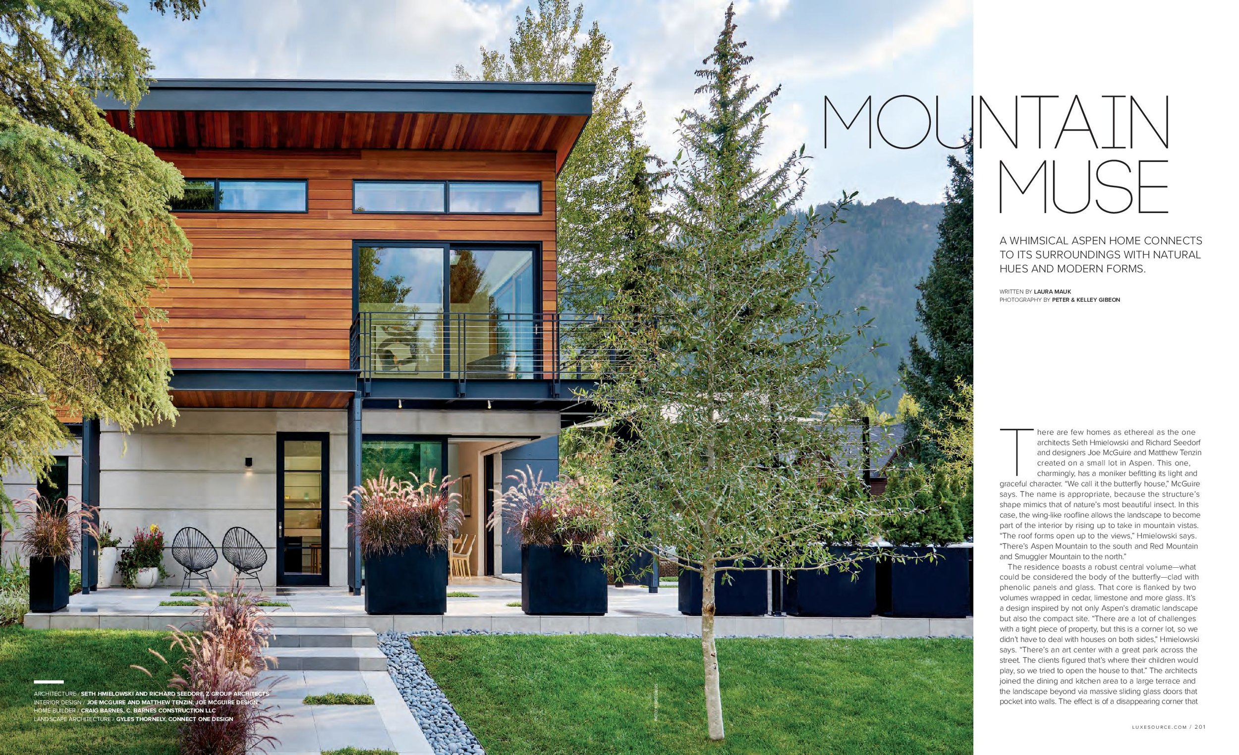
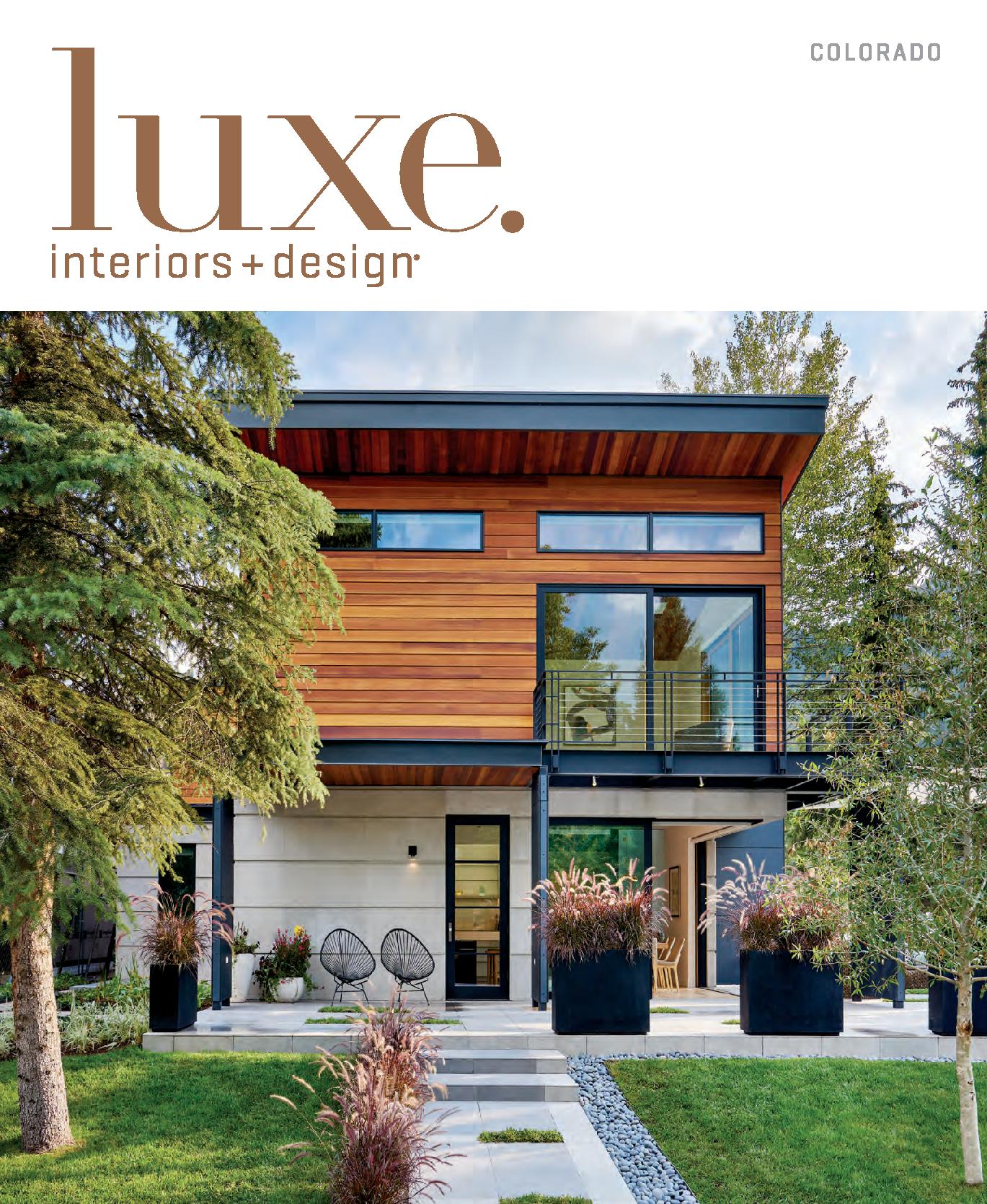
There are few homes as ethereal as the one architects Seth Hmielowski and Richard Seedorf and designers Joe McGuire and Matthew Tenzin created on a small lot in Aspen. This one, charmingly, has a moniker befitting its light and graceful character. “We call it the butterfly house,” McGuire says. The name is appropriate, because the structure’s shape mimics that of nature’s most beautiful insect. In this case, the wing-like roofline allows the landscape to become part of the interior by rising up to take in mountain vistas. “The roof forms open up to the views,” Hmielowski says. “There’s Aspen Mountain to the south and Red Mountain and Smuggler Mountain to the north.”
+ Click here to read the full article!
There are few homes as ethereal as the one architects Seth Hmielowski and Richard Seedorf and designers Joe McGuire and Matthew Tenzin created on a small lot in Aspen. This one, charmingly, has a moniker befitting its light and graceful character. “We call it the butterfly house,” McGuire says. The name is appropriate, because the structure’s shape mimics that of nature’s most beautiful insect. In this case, the wing-like roofline allows the landscape to become part of the interior by rising up to take in mountain vistas. “The roof forms open up to the views,” Hmielowski says. “There’s Aspen Mountain to the south and Red Mountain and Smuggler Mountain to the north.”
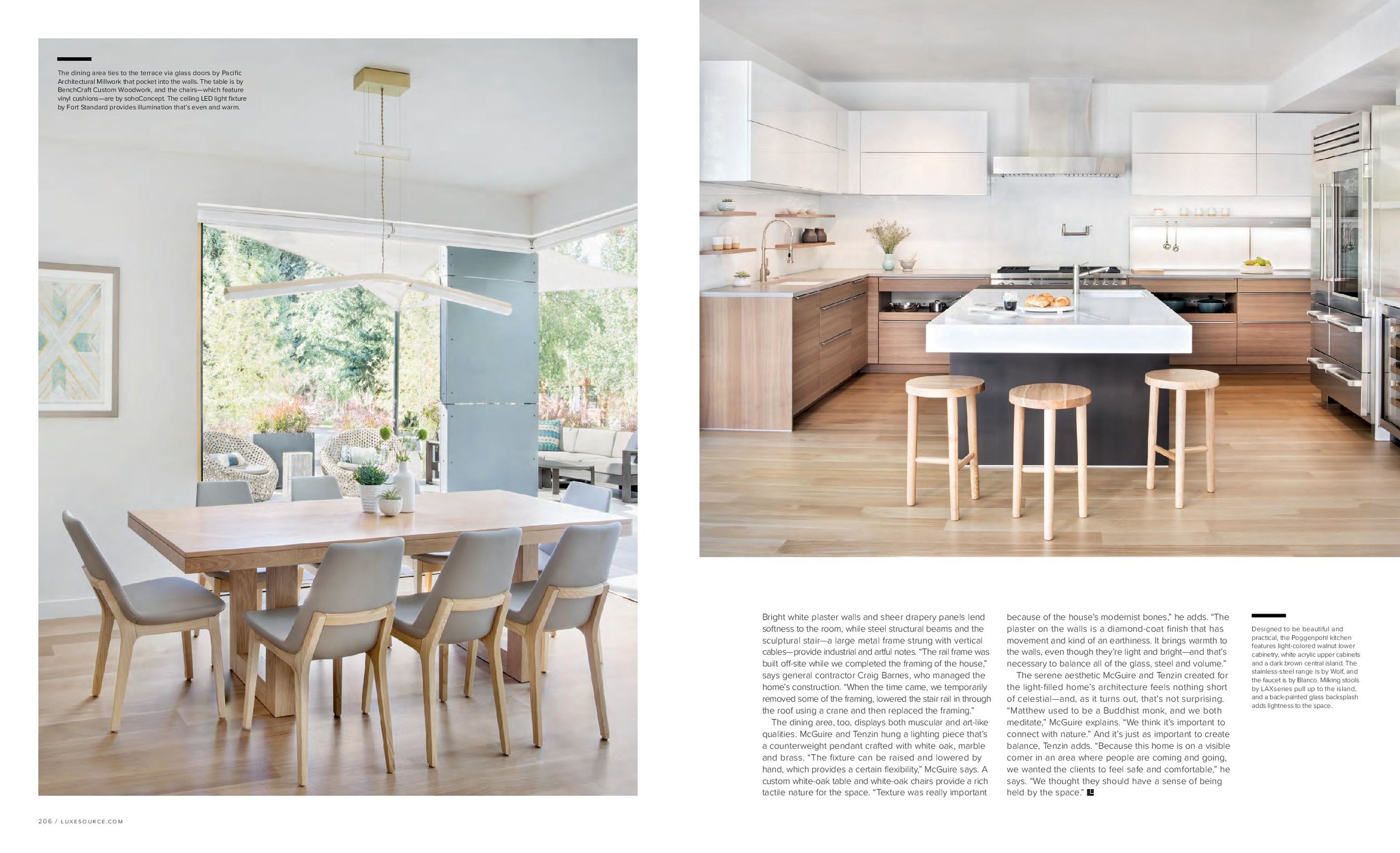
The residence boasts a robust central volume–what could be considered the body of the butterfly–clad with phenolic panels and glass. That core is flanked by two volumes wrapped in cedar, limestone and more glass. It’s a design inspired by not only Aspen’s dramatic landscape but also the compact site. “There are a lot of challenges with a tight piece of property, but this is a corner lot, so we didn’t have to deal with houses on both sides,” Hmielowski says. “There’s an art center with a great park across the street. The clients figured that’s where their children would play, so we tried to open the house to that.” The architects joined the dining and kitchen area to a large terrace and the landscape beyond via massive sliding glass doors that pocket into walls. The effect is of a disappearing corner that leaves no boundary between interior and exterior space. “The outdoor entertainment areas wrap around two sides of the house,” says landscape architect Gyles Thornely, who designed the grounds. “The terraces are paved with two different colors of porcelain tiles by Porcelanosa. They are interrupted every so often with planting strips filled with bright green low-growing sedum, which intercepts surface-water runoff and melting snow.”
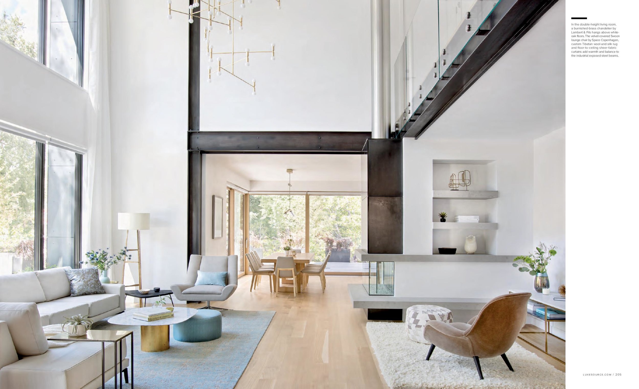
To highlight mountain views and obscure urban scenes, the architects lifted the ground floor. “When you’re in a city, there are parked cars, people and businesses,” Hmielowski says. “We elevated the main level so when you sit in the dining area or outside on the patio, you are looking over the cars instead of into them. Raising it a foot and a half takes you off the street level.” Once they found the optimal height for the overall structure of the house, the architects created a soaring ceiling plane for the living room. “Because it’s such a small lot, it’s all about having a grand experience and bringing natural light deep into the structure,” Hmielowski says. The two-story space is marked by expansive windows and a bridge with a glass rail that overlooks two sitting areas and accesses the bedrooms, which are housed in the so-called butterfly wings.
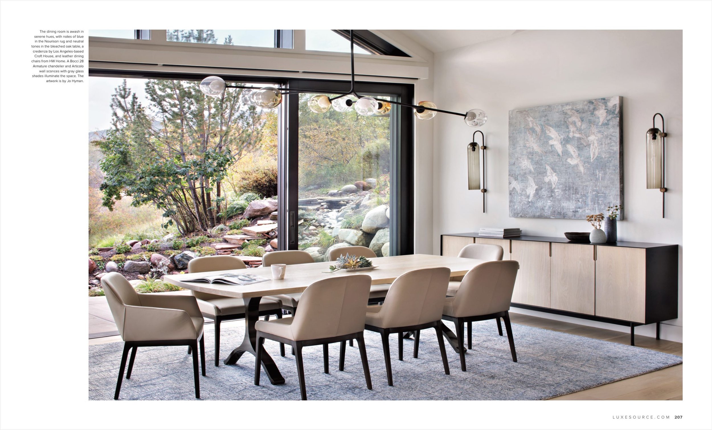
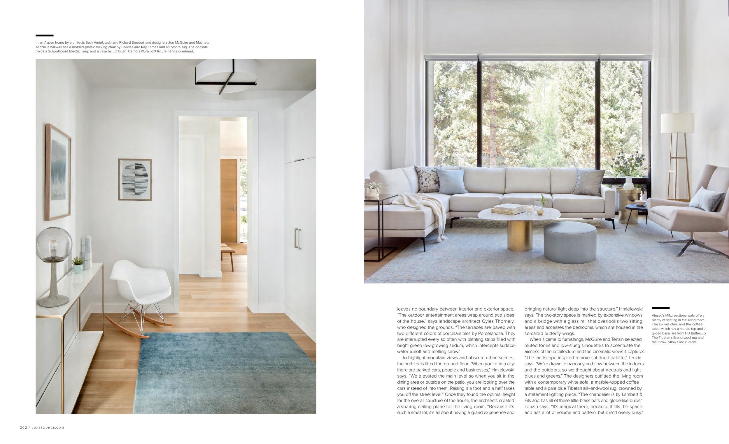
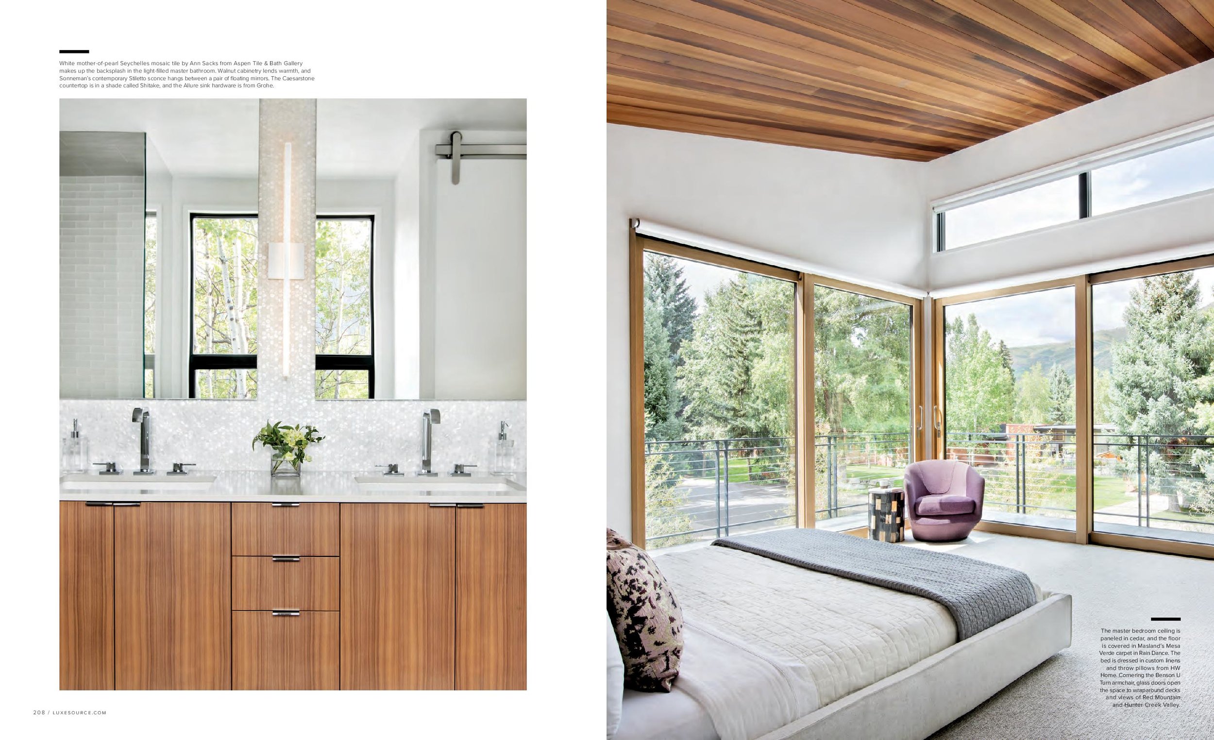
When it came to furnishings, McGuire and Tenzin selected muted tones and low-slung silhouettes to accentuate the airiness of the architecture and the cinematic views it captures. “The landscape inspired a more subdued palette,” Tenzin says. “We’re drawn to harmony and flow between the indoors and the outdoors, so we thought about neutrals and light blues and greens.” The designers outfitted the living room with a contemporary white sofa, a marble-topped coffee table and a pale blue Tibetan silk-and-wool rug, crowned by a statement lighting piece. “The chandelier is by Lambert & Fils and has all of these little brass bars and globe-like bulbs,” Tenzin says. “It’s magical there, because it fills the space and has a lot of volume and pattern, but it isn’t overly busy.”
Bright white plaster walls and sheer drapery panels lend softness to the room, while steel structural beams and the sculptural stair–a large metal frame strung with vertical cables–provide industrial and artful notes. “The rail frame was built off-site while we completed the framing of the house,” says general contractor Craig Barnes, who managed the home’s construction. “When the time came, we temporarily removed some of the framing, lowered the stair rail in through the roof using a crane and then replaced the framing.”
The dining area, too, displays both muscular and art-like qualities. McGuire and Tenzin hung a lighting piece that’s a counterweight pendant crafted with white oak, marble and brass. “The fixture can be raised and lowered by hand, which provides a certain flexibility,” McGuire says. A custom white-oak table and white-oak chairs provide a rich tactile nature for the space. “Texture was really important because of the house’s modernist bones,” he adds. “The plaster on the walls is a diamond-coat finish that has movement and kind of an earthiness. It brings warmth to the walls, even though they’re light and bright–and that’s necessary to balance all of the glass, steel and volume.”
The serene aesthetic McGuire and Tenzin created for the light-filled home’s architecture feels nothing short of celestial–and, as it turns out, that’s not surprising. “Matthew used to be a Buddhist monk, and we both meditate,” McGuire explains. “We think it’s important to connect with nature.” And it’s just as important to create balance, Tenzin adds. “Because this home is on a visible corner in an area where people are coming and going, we wanted the clients to feel safe and comfortable,” he says. “We thought they should have a sense of being held by the space.”
“Italian Accent” Featured in Luxe
Written by Jennifer Sergent, Photography by Peter and Kelley Gibeon
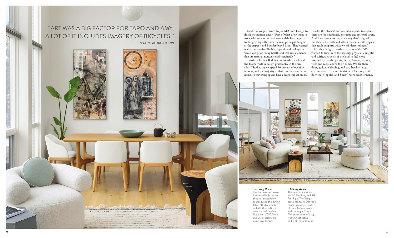
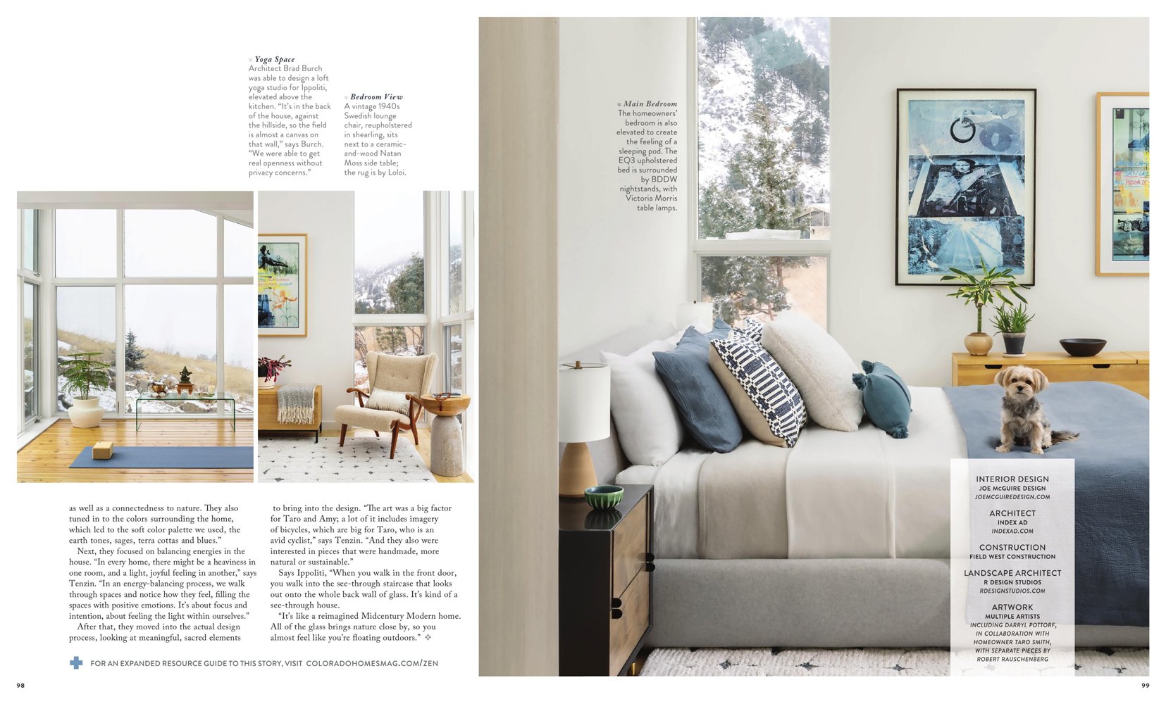
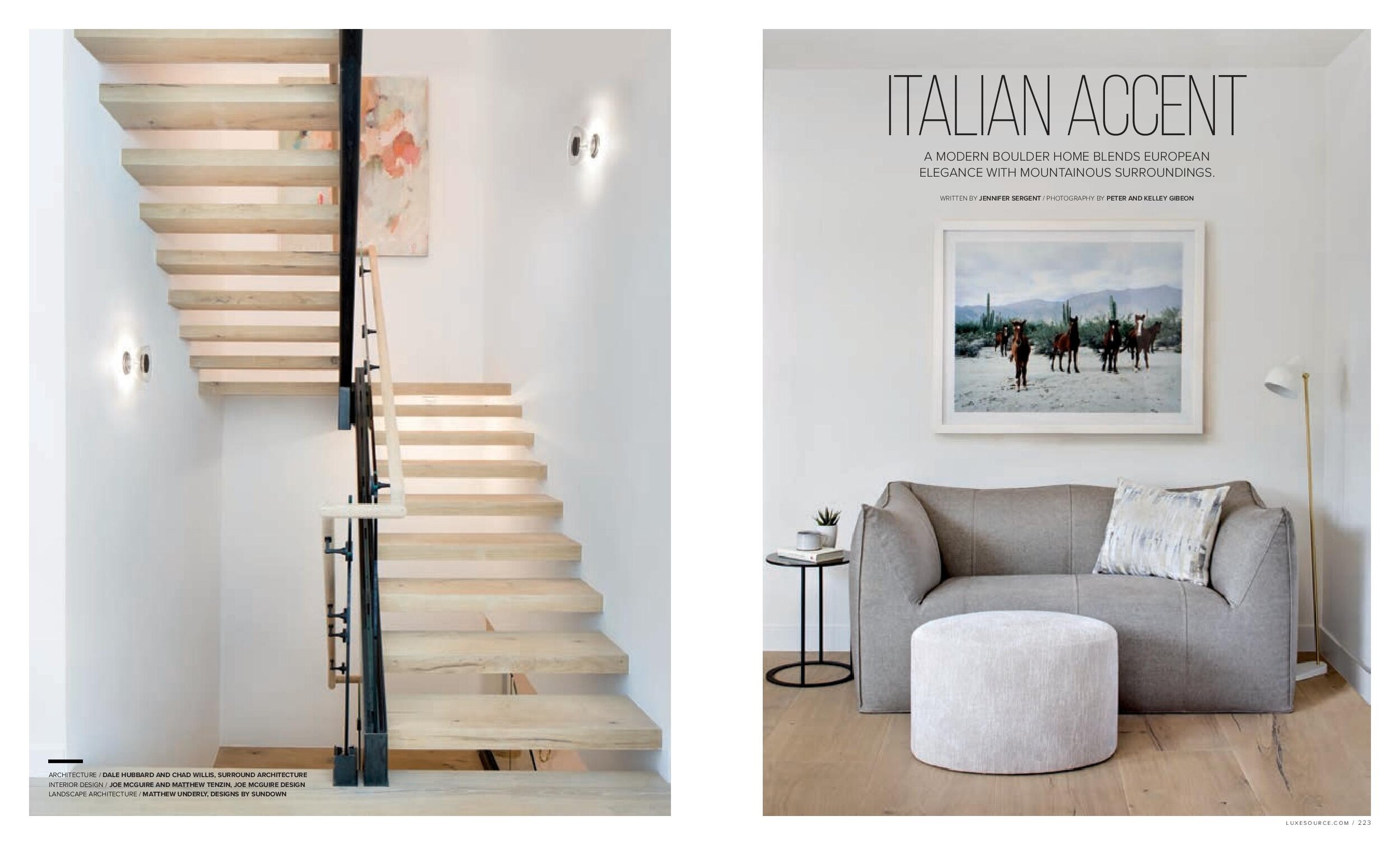
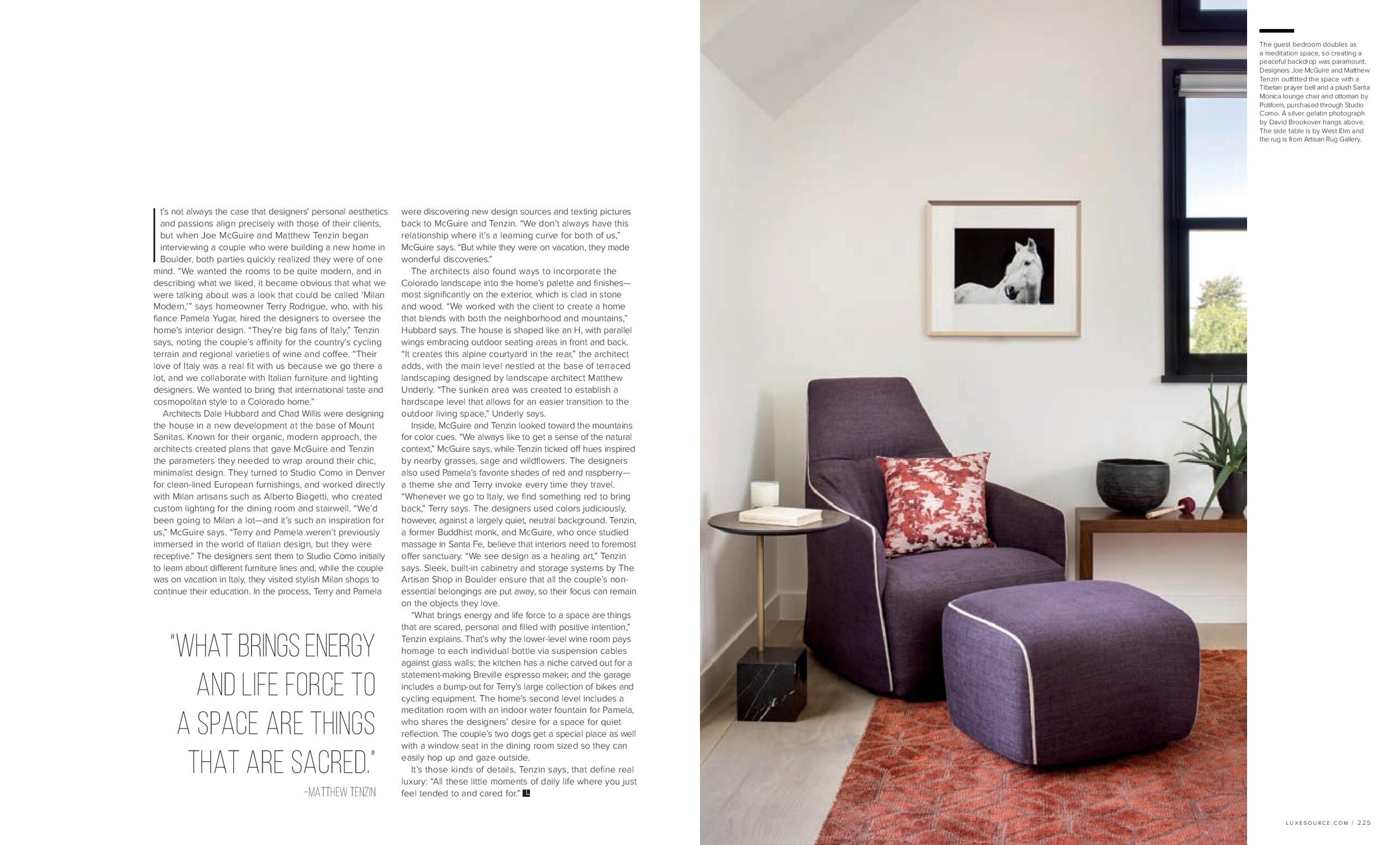
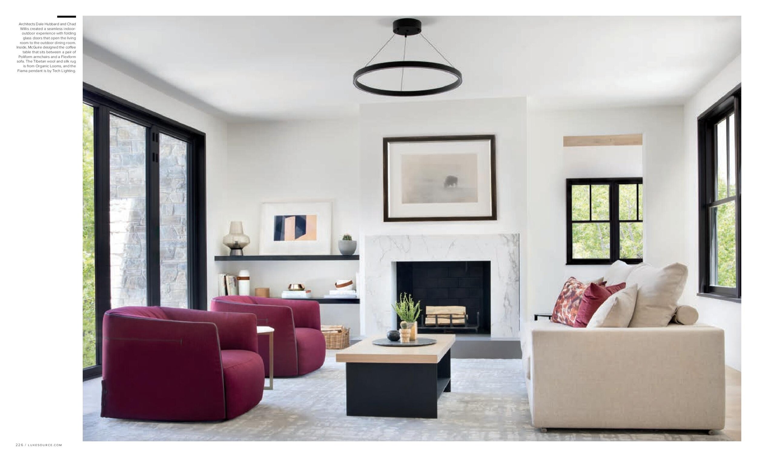
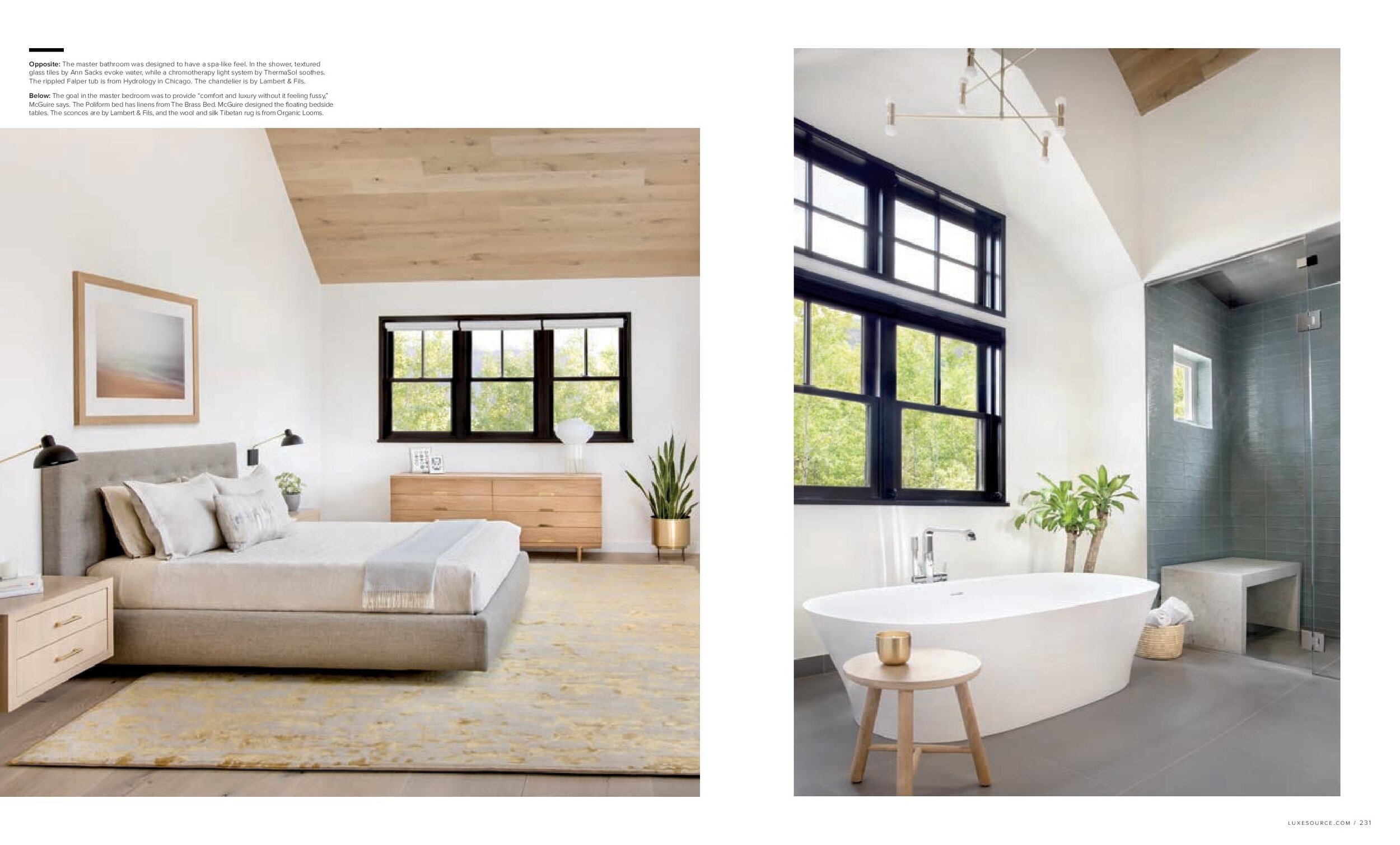
It’s not always the case that designers’ personal aesthetics and passions align precisely with those of their clients, but when Joe McGuire and Matthew Tenzin began interviewing a couple who were building a new home in Boulder, Colorado, both parties quickly realized they were of one mind. “We wanted the rooms to be quite modern, and in describing what we liked, it became obvious that what we were talking about was a look that could be called ‘Milan Modern,’” says homeowner Terry Rodrigue, who, with his fiance Pamela Yugar, hired the designers to oversee the home’s interior design. “They’re big fans of Italy,” Tenzin says, noting the couple’s affinity for the country’s cycling terrain and regional varieties of wine and coffee. “Their love of Italy was a real fit with us because we go there a lot, and we collaborate with Italian furniture and lighting designers. We wanted to bring that international taste and cosmopolitan style to a Colorado home.”
+ Click here to read the full article!
It’s not always the case that designers’ personal aesthetics and passions align precisely with those of their clients, but when Joe McGuire and Matthew Tenzin began interviewing a couple who were building a new home in Boulder, Colorado, both parties quickly realized they were of one mind. “We wanted the rooms to be quite modern, and in describing what we liked, it became obvious that what we were talking about was a look that could be called ‘Milan Modern,’” says homeowner Terry Rodrigue, who, with his fiance Pamela Yugar, hired the designers to oversee the home’s interior design. “They’re big fans of Italy,” Tenzin says, noting the couple’s affinity for the country’s cycling terrain and regional varieties of wine and coffee. “Their love of Italy was a real fit with us because we go there a lot, and we collaborate with Italian furniture and lighting designers. We wanted to bring that international taste and cosmopolitan style to a Colorado home.”
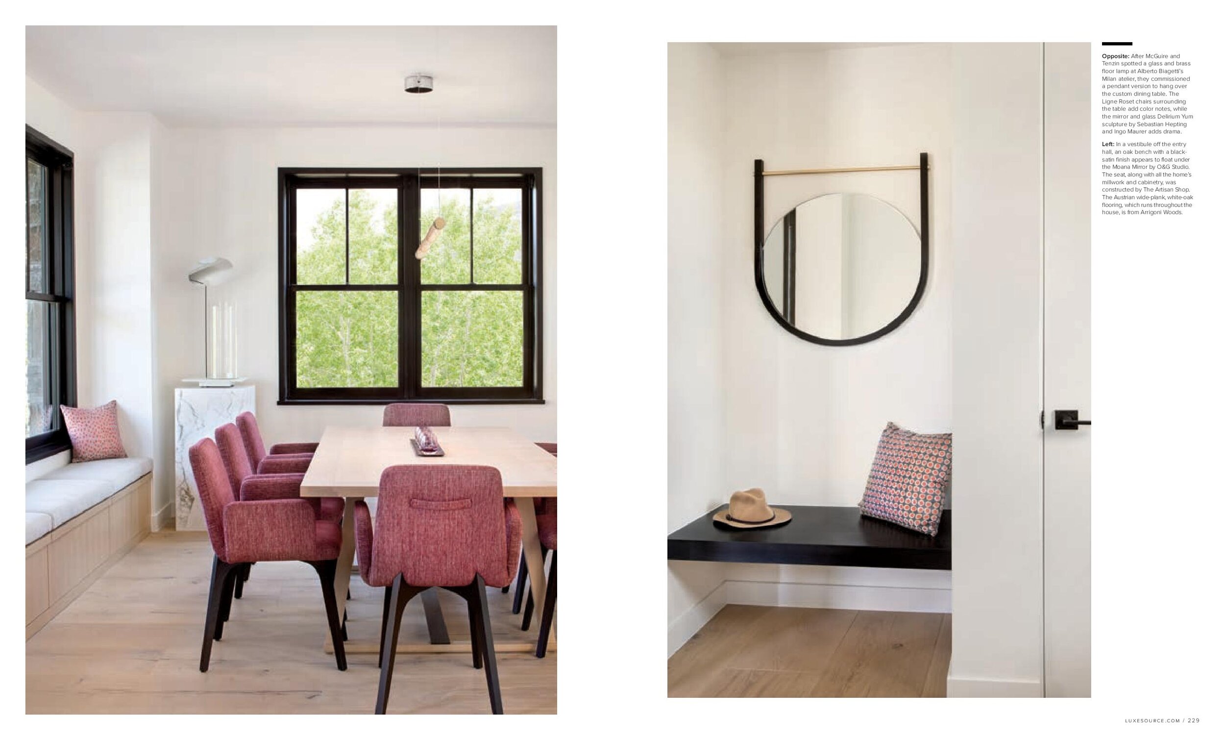
Architects Dale Hubbard and Chad Willis were designing the house in a new development at the base of Mount Sanitas. Known for their organic, modern approach, the architects created plans that gave McGuire and Tenzin the parameters they needed to wrap around their chic, minimalist design. They turned to Studio Como in Denver for clean-lined European furnishings, and worked directly with Milan artisans such as Alberto Biagetti, who created custom lighting for the dining room and stairwell. “We’d been going to Milan a lot–and it’s such an inspiration for us,” McGuire says. “Terry and Pamela weren’t previously immersed in the world of Italian design, but they were receptive.” The designers sent them to Studio Como initially to learn about different furniture lines and, while the couple was on vacation in Italy, they visited stylish Milan shops to continue their education. In the process, Terry and Pamela were discovering new design sources and texting pictures back to McGuire and Tenzin. “We don’t always have this relationship where it’s a learning curve for both of us,” McGuire says. “But while they were on vacation, they made wonderful discoveries.”
The architects also found ways to incorporate the Colorado landscape into the home’s palette and finishes–most significantly on the exterior, which is clad in stone and wood. “We worked with the client to create a home that blends with both the neighborhood and mountains,” Hubbard says. The house is shaped like an H, with parallel wings embracing outdoor seating areas in front and back. “It creates this alpine courtyard in the rear,” the architect adds, with the main level nestled at the base of terraced landscaping designed by landscape architect Matthew Underly. “The sunken area was created to establish a hardscape level that allows for an easier transition to the outdoor living space,” Underly says.
Inside, McGuire and Tenzin looked toward the mountains for color cues. “We always like to get a sense of the natural context,” McGuire says, while Tenzin ticked off hues inspired by nearby grasses, sage and wildflowers. The designers also used Pamela’s favorite shades of red and raspberry–a theme she and Terry invoke every time they travel. “Whenever we go to Italy, we find something red to bring back,” Terry says. The designers used colors judiciously, however, against a largely quiet, neutral background. Tenzin, a former Buddhist monk, and McGuire, who once studied massage in Santa Fe, believe that interiors need to foremost offer sanctuary. “We see design as a healing art,” Tenzin says. Sleek, built-in cabinetry and storage systems by The Artisan Shop in Boulder ensure that all the couple’s non-essential belongings are put away, so their focus can remain on the objects they love.
“What brings energy and life force to a space are things that are scared, personal and filled with positive intention,” Tenzin explains. That’s why the lower-level wine room pays homage to each individual bottle via suspension cables against glass walls; the kitchen has a niche carved out for a statement-making Breville espresso maker; and the garage includes a bump-out for Terry’s large collection of bikes and cycling equipment. The home’s second level includes a meditation room with an indoor water fountain for Pamela, who shares the designers’ desire for a space for quiet reflection. The couple’s two dogs get a special place as well with a window seat in the dining room sized so they can easily hop up and gaze outside.
It’s those kinds of details, Tenzin says, that define real luxury: “All these little moments of daily life where you just feel tended to and cared for.”
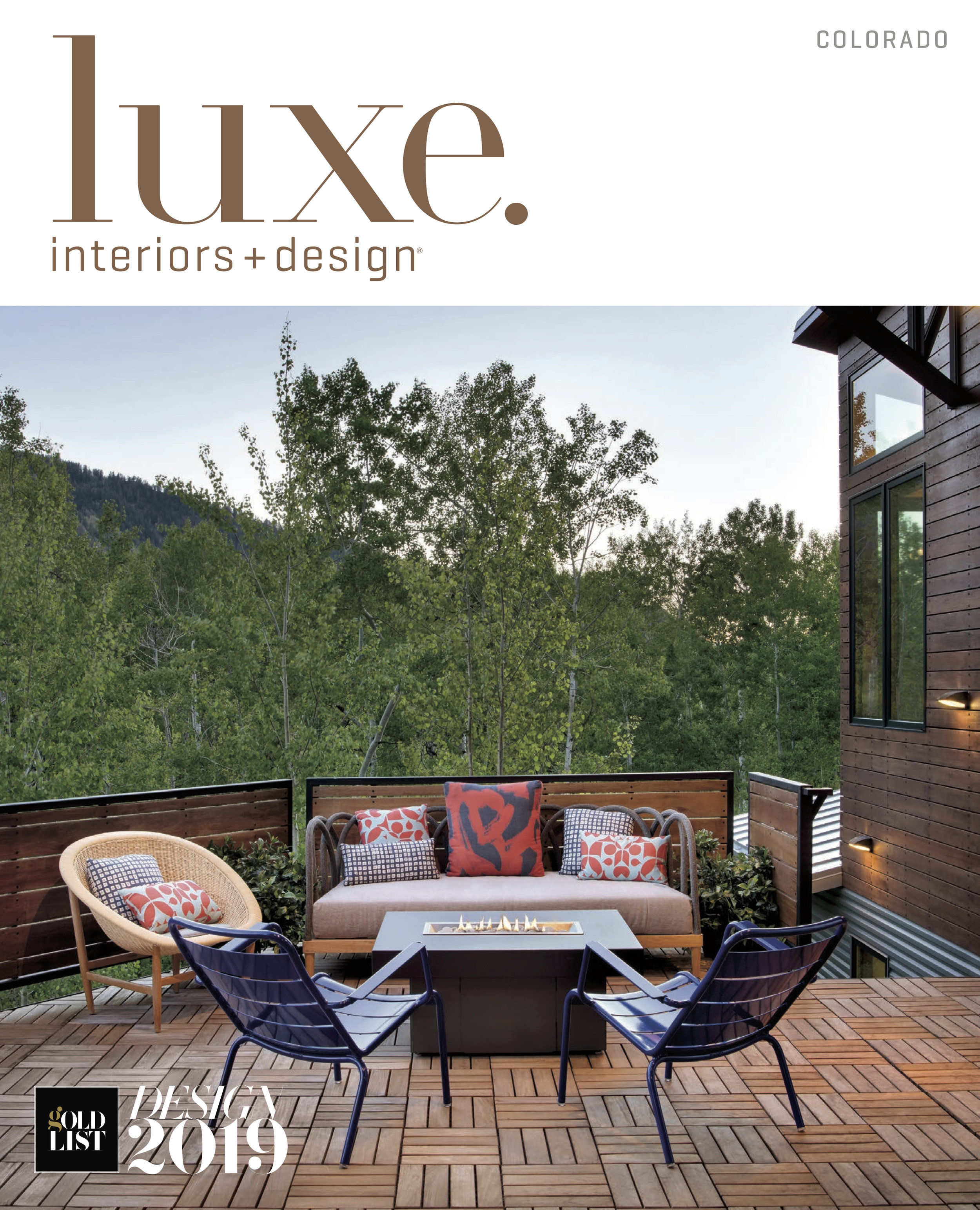
“Heirloom Harmony” Featured in Luxe
Written by Leilani Marie Labong, Photography by Peter and Kelley Gibeon
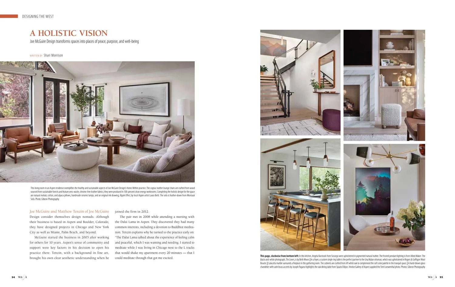
The owner of this modern Aspen home says her friends generally regard her tastes as personality driven and one-of-a-kind. It’s that unique style that made her particularly enthusiastic to own a house with enough space to display her eclectic family heirlooms, ranging from Navajo rugs to wooden Nordic skis.
+ Click here to read the full article!
The owner of this modern Aspen home says her friends generally regard her tastes as personality driven and one-of-a-kind. It’s that unique style that made her particularly enthusiastic to own a house with enough space to display her eclectic family heirlooms, ranging from Navajo rugs to wooden Nordic skis.
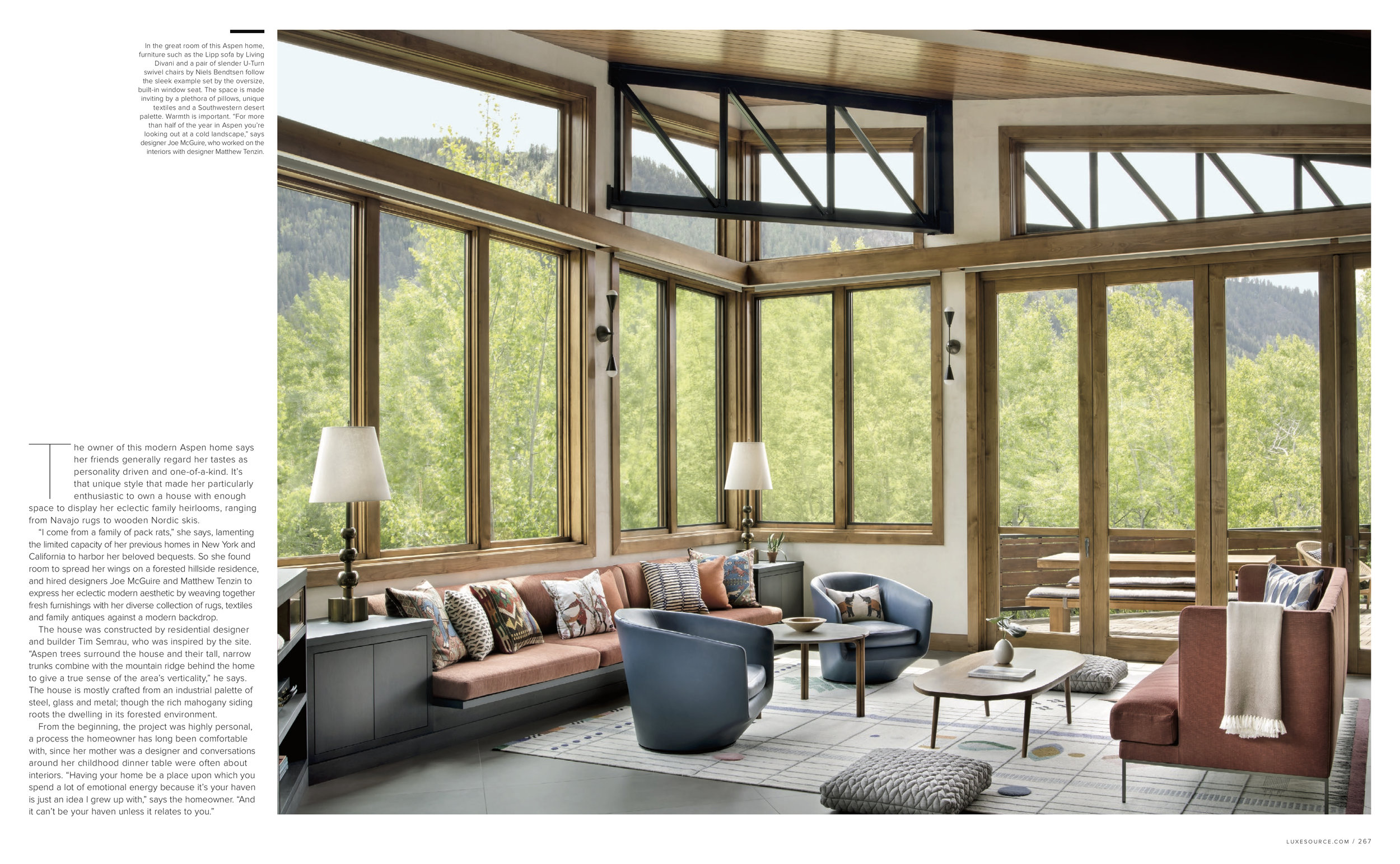
“I come from a family of pack rats,” she says, lamenting the limited capacity of her previous homes in New York and California to harbor her beloved bequests. So she found room to spread her wings on a forested hillside residence, and hired designers Joe McGuire and Matthew Tenzin to express her eclectic modern aesthetic by weaving together fresh furnishings with her diverse collection of rugs, textiles and family antiques against a modern backdrop.
The house was constructed by residential designer and builder Tim Semrau, who was inspired by the site. “Aspen trees surround the house and their tall, narrow trunks combine with the mountain ridge behind the home to give a true sense of the area’s verticality,” he says. The house is mostly crafted from an industrial palette of steel, glass and metal; though the rich mahogany siding roots the dwelling in its forested environment.
From the beginning, the project was highly personal, a process the homeowner has long been comfortable with, since her mother was a designer and conversations around her childhood dinner table were often about interiors. “Having your home be a place upon which you spend a lot of emotional energy because it’s your haven is just an idea I grew up with,” says the homeowner. “And it can’t be your haven unless it relates to you.”
The designers whole-heartedly agree. “It was a highly collaborative process driven by the client’s creativity and international tastes,” Tenzin says. “She wanted us to help her come up with an overall plan, and she loves so many kinds of patterns, colors and styles, she needed help reining it all in and creating a sense of balance and harmony.” Excited to punctuate her inheritances with a new selection of textiles and gallery-worthy sculptural furnishings, McGuire and Tenzin began to create stylish rooms that also feel familiar and comfortable.
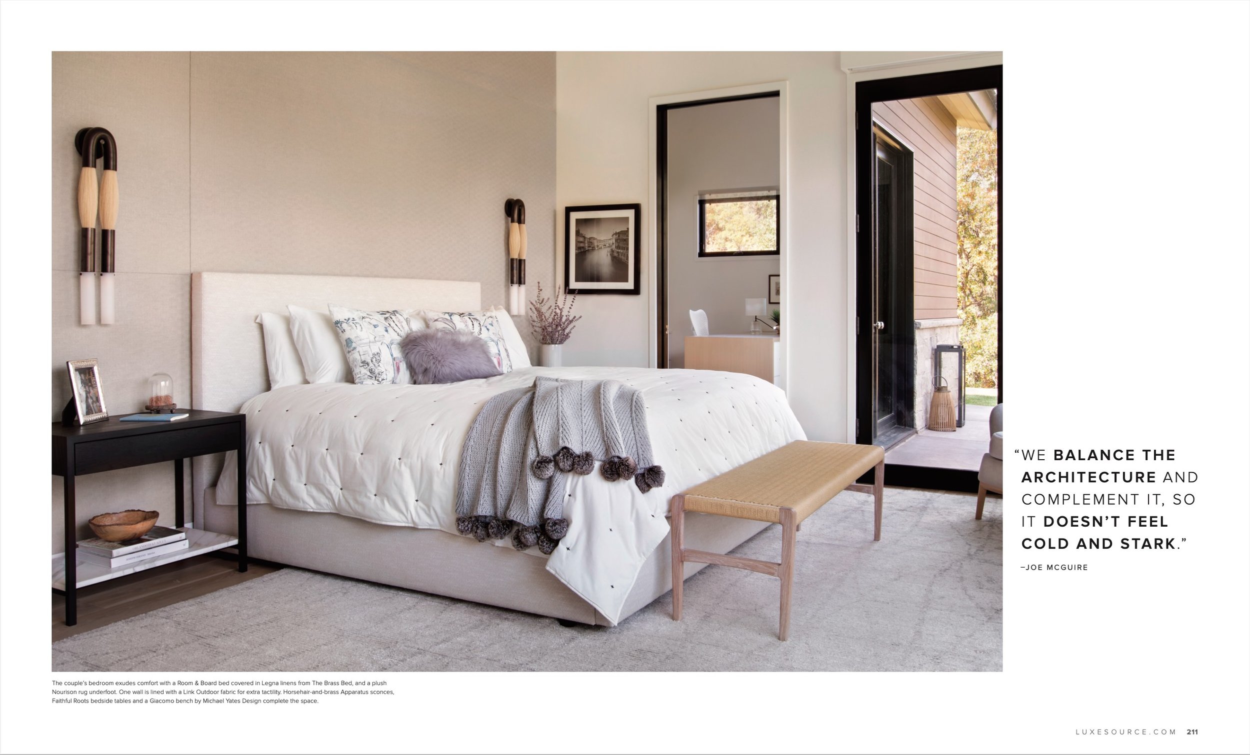
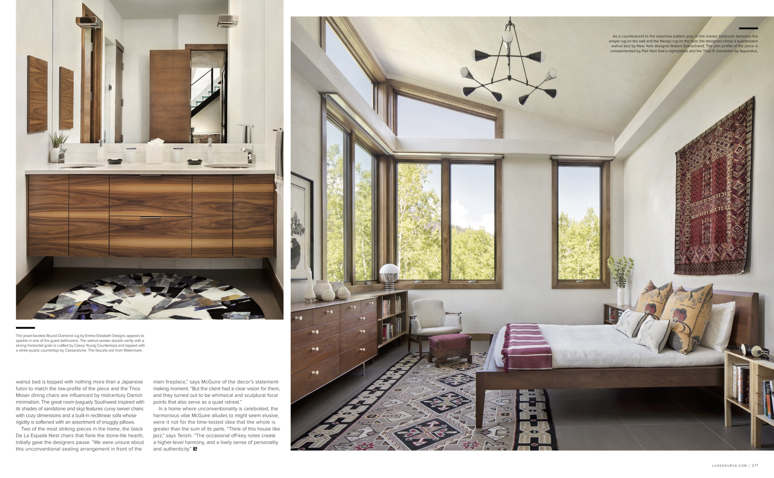
In the master bedroom, for instance, a wool-and-silk prayer rug from the family collection hangs on the wall, while a more recent acquisition, a Navajo rug, lies on the floor. The crimson colors and geometric motifs found in both pieces create cohesiveness. A pair of pillow shams printed with Art Nouveau painter Henri de Toulouse-Lautrec’s famous cancan girls are a novel choice in a room where ethnic patterns dominate.
Likewise, in one of the guest bedrooms, another tribal textile on the wall–a Two Grey Hills Navajo rug inherited from the homeowner’s great grandmother–effortlessly jives with the woven-leather bench at the foot of the bed. The neon green, cerused-wood bedside tables play a dynamic role in an otherwise neutral space.
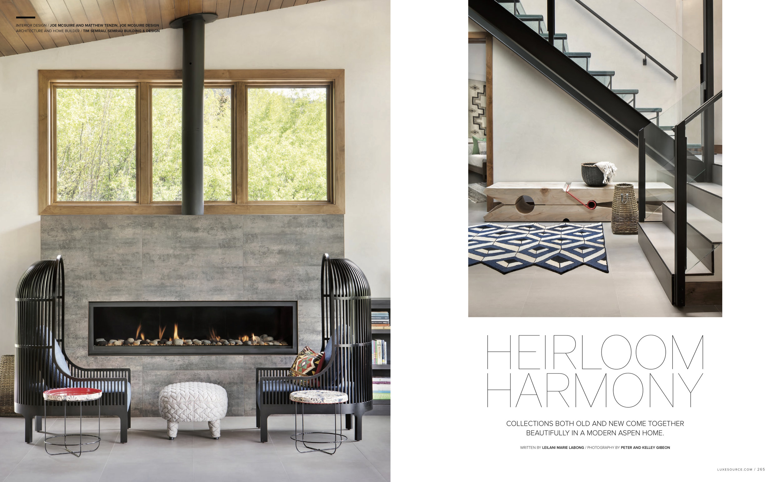
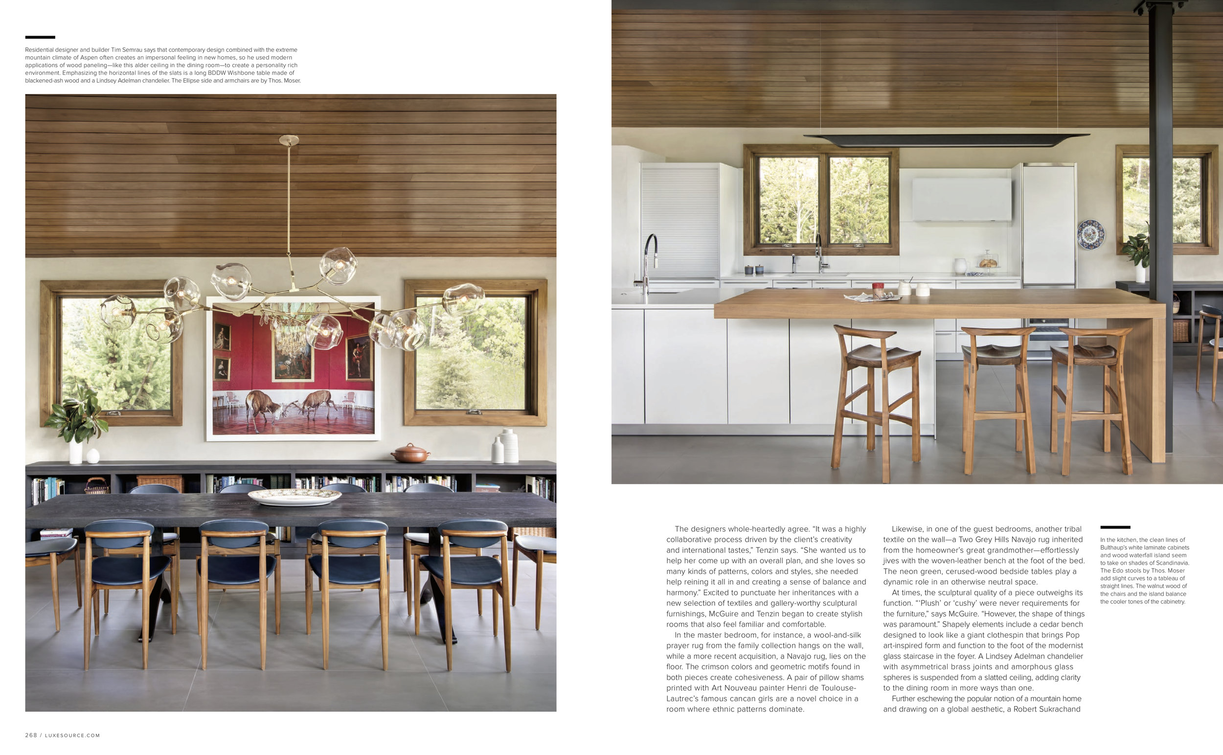
At times, the sculptural quality of a piece outweighs its function. “‘Plush’ or ‘cushy’ were never requirements for the furniture,” says McGuire. “However, the shape of things was paramount.” Shapely elements include a cedar bench designed to look like a giant clothespin that brings Pop art-inspired form and function to the foot of the modernist glass staircase in the foyer. A Lindsey Adelman chandelier with asymmetrical brass joints and amorphous glass spheres is suspended from a slatted ceiling, adding clarity to the dining room in more ways than one.
Further eschewing the popular notion of a mountain home and drawing on a global aesthetic, a Robert Sukrachand walnut bed is topped with nothing more than a Japanese futon to match the low-profile of the piece and the Thos. Moser dining chairs are influenced by midcentury Danish minimalism. The great room (vaguely Southwest inspired with its shades of sandstone and sky) features curvy swivel chairs with cozy dimensions and a built-in rectilinear sofa whose rigidity is softened with an assortment of snuggly pillows.
Two of the most striking pieces in the home, the black De La Espada Nest chairs that flank the stone-tile hearth, initially gave the designers pause. “We were unsure about this unconventional seating arrangement in front of the main fireplace,” says McGuire of the decor’s statement-making moment. “But the client had a clear vision for them, and they turned out to be whimsical and sculptural focal points that also serve as a quiet retreat.”
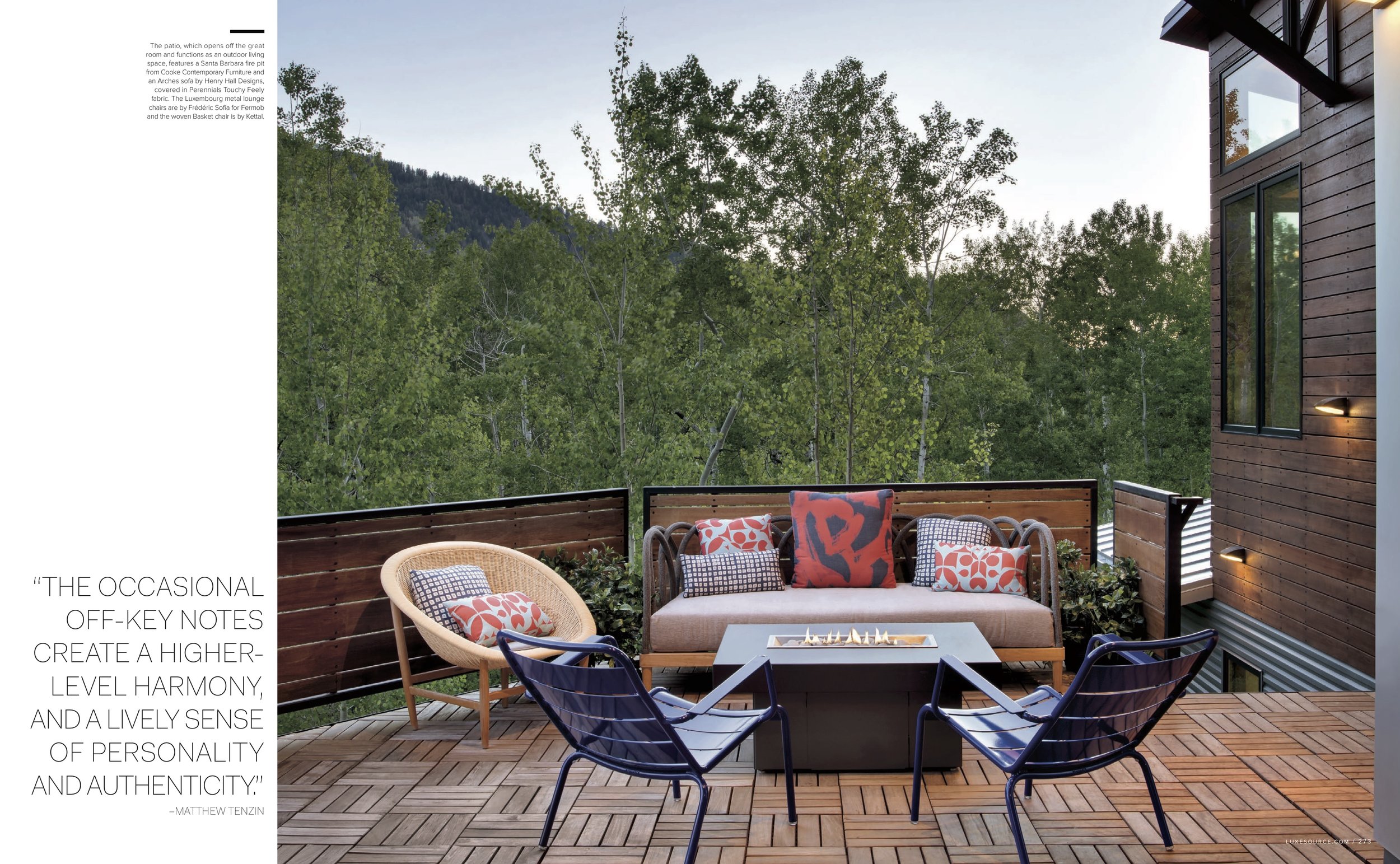
In a home where unconventionality is celebrated, the harmonious vibe McGuire alludes to might seem elusive, were it not for the time-tested idea that the whole is greater than the sum of its parts. “Think of this house like jazz,” says Tenzin. “The occasional off-key notes create a higher-level harmony, and a lively sense of personality and authenticity.”
“High Design”
Written by Linda Hayes and Michael McCarthy
Through the challenges of the past year, the creative forces behind the rooms we love have grown even stronger. We’re seeing innovative uses of spaces, a keener understanding of room function and flow, and an undaunted flair for color and imagination. In short, the past year has given us a stronger appreciation for our homes and the role they play in our everyday lives. What you’ll see on the following pages are the designers in Aspen and the Roaring Fork Valley who bring comfort, versatility and a mix of modern and mountain elegance into every square inch of a client’s house. Here’s to their collective vision of beauty.
Collaborating with the owner of the design of her eclectic bedroom helped spark the nature and spirit of this soothing space. “She’s a creative soul with a distinctive eye,” says Joe McGuire, co-owner with Matthew Tenzin of Joe McGuire Design. “Everything about it is interesting, collected and assembled in a way that allows distinctive pieces to work together.” To achieve the desired restful effect, McGuire selected a custom Sukrachand walnut bed to support the owner’s tatami mattress and covered pillow shams with vintage Moulin Rouge fabric. A vintage Native American rug grounds the space, while an Apparatus Triad 9 chandelier shines light from above.

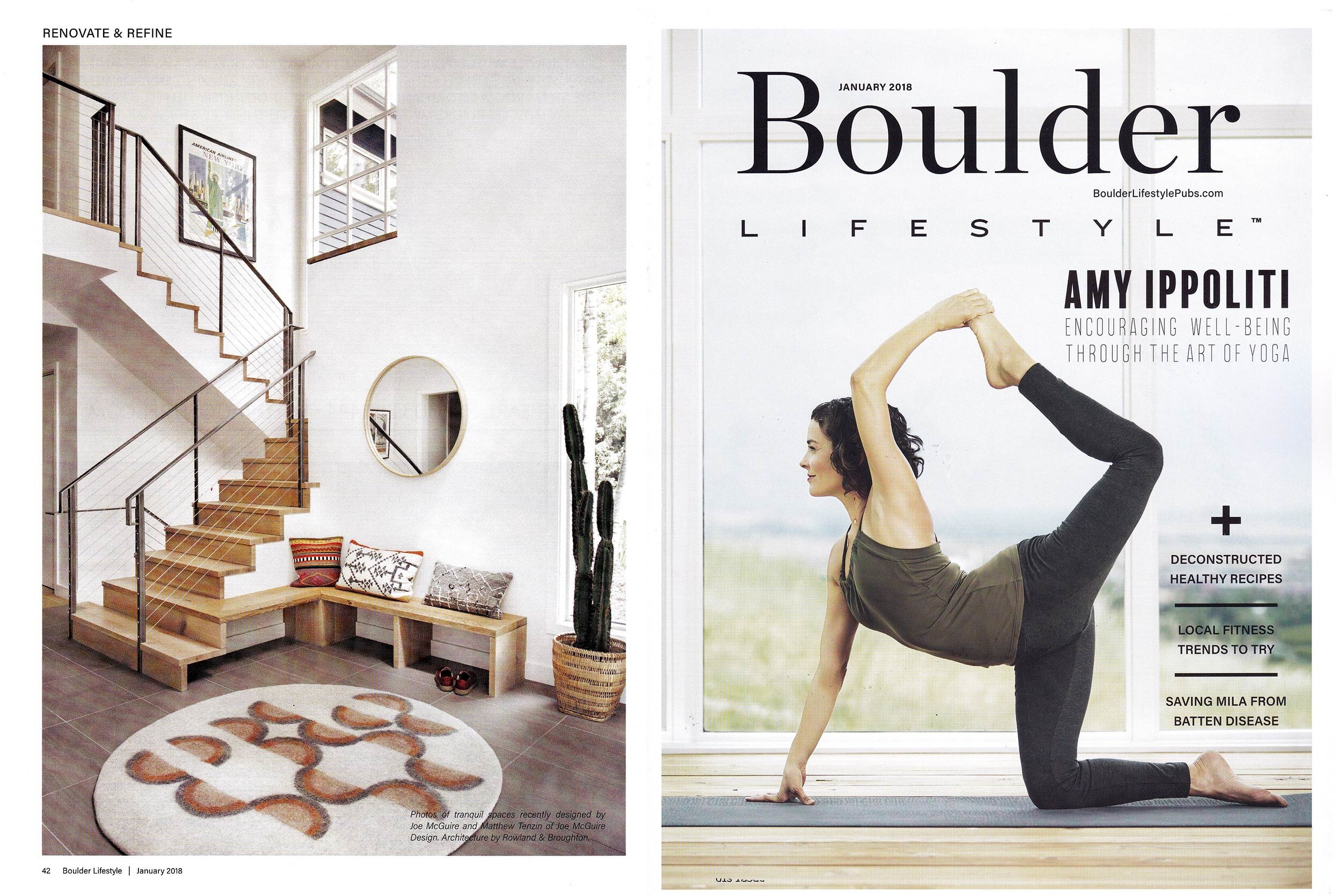
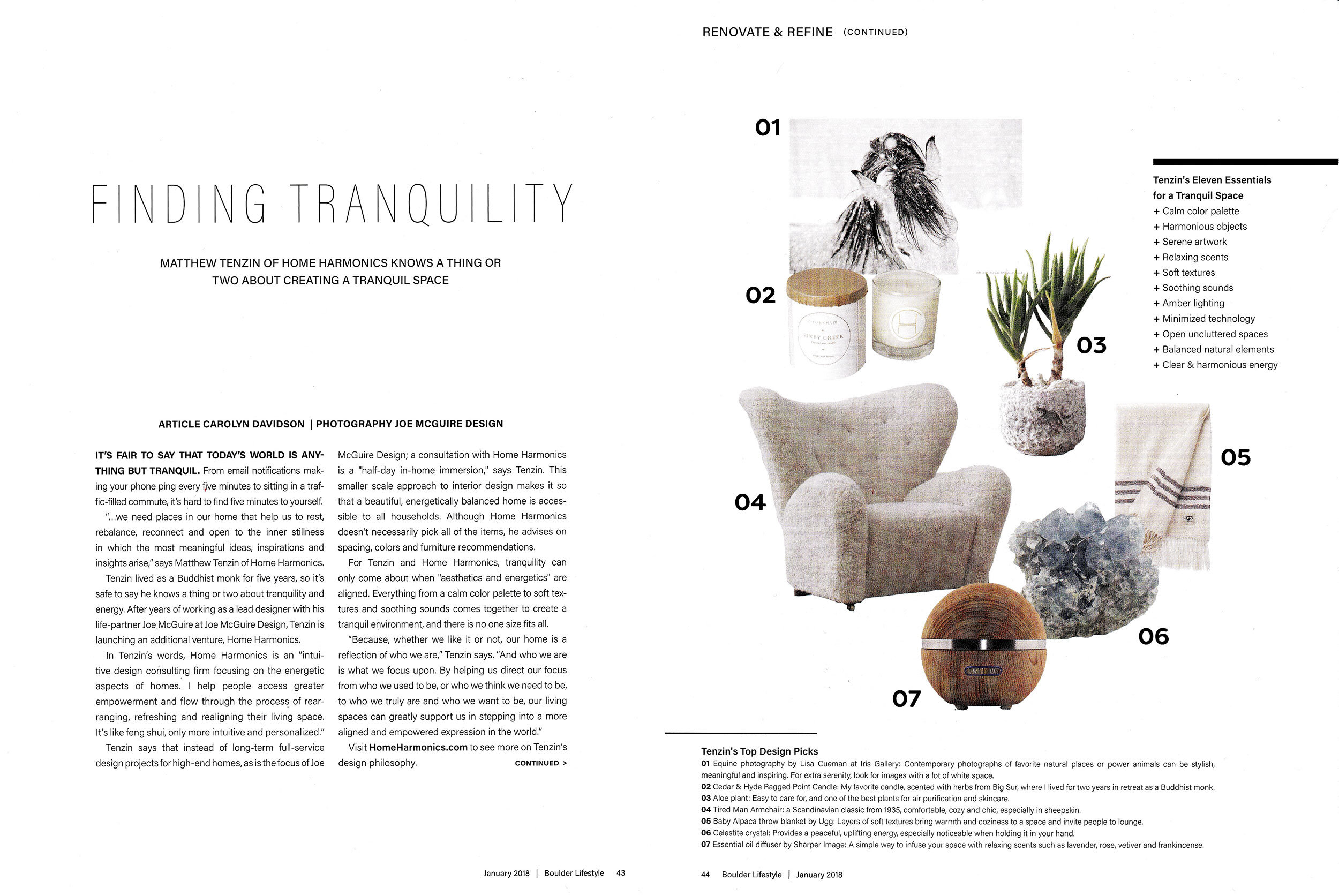
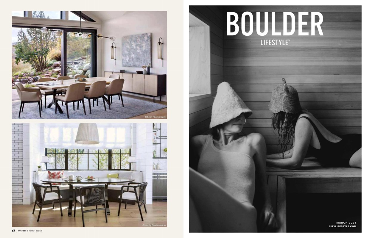
“Finding Tranquility” Featured in Boulder Lifestyle
Written by Carolyn Davidson, Photography by Joe McGuire Design
It’s fair to say that today’s world is anything but tranquil. From email notifications making your phone ping every five minutes to sitting in a traffic-filled commute, it’s hard to find five minutes to yourself.
+ Click here to read the full article!
“…we need places in our home that help us to rest, rebalance, reconnect and open to the inner stillness in which the most meaningful ideas, inspirations and insights arise,” says Matthew Tenzin of Home Harmonics.
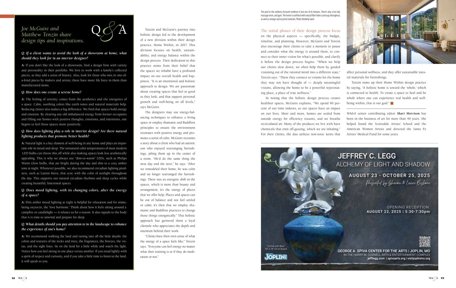
Tenzin lived as a Buddhist monk for five years, so it’s safe to say he knows a thing or two about tranquility and energy. After years of working as a lead designer with his life-partner Joe McGuire at Joe McGuire Design, Tenzin is launching an additional venture, Home Harmonics.
In Tenzin’s words, Home Harmonics is an “intuitive design consulting firm focusing on the energetic aspects of homes. I help people access greater empowerment and flow through the process of rearranging, refreshing and realigning their living space. It’s like feng shui, only more intuitive and personalized.”
Tenzin says that instead of long-term full-service design projects for high-end homes, as is the focus of Joe McGuire Design; a consultation with Home Harmonics is a “half-day in-home immersion,” says Tenzin. This smaller scale approach to interior design makes it so that a beautiful, energetically balanced home is accessible to all households. Although Home Harmonics doesn’t necessarily pick all of the items, he advises on spacing, colors and furniture recommendations.
For Tenzin and Home Harmonics, tranquility can only come about when “aesthetics and energetics” are aligned. Everything from a calm color palette to soft textures and soothing sounds comes together to create a tranquil environment, and there is no one size fits all.
“Because, whether we like it or not, our home is a reflection of who we are,” Tenzin says. “And who we are is what we focus upon. By helping us direct our focus from who we used to be, or who we think we need to be, to who we truly are and who we want to be, our living spaces can greatly support us in stepping into a more aligned and empowered expression in the world.”
Visit HomeHarmonics.com to see more on Tenzin’s design philosophy.
Tenzin’s Top Design Picks
01 Equine photography by Lisa Cueman at Iris Gallery: Contemporary photographs of favorite natural places or power animals can be stylish, meaningful and inspiring. For extra serenity, look for images with a lot of white space.
02 Cedar & Hydde Ragged Point Candle: My favorite candle, scented with herbs from Big Sur, where I lived for two years in retreat as a Buddhist monk.
03 Aloe Plant: Easy to care for, and one of the best plants for air purification and skincare.
04 Tired Man Armchair: a Scandinavian classic from 1935, comfortable, cozy and chic, especially in sheepskin.
05 Baby Alpaca throw blanket by Ugg: Layers of soft textures bring warmth and coziness to a space and invite people to lounge.
06 Celestite crystal: Provides a peaceful, uplifting energy, especially noticeable when holding it in your hand.
07 Essential oil diffuser by Sharper Image. A simple way to infuse your space with relaxing scents such as lavender, rose, vetiver and frankincense.

